A Dive into UX Card Sorting and Schema Design Techniques
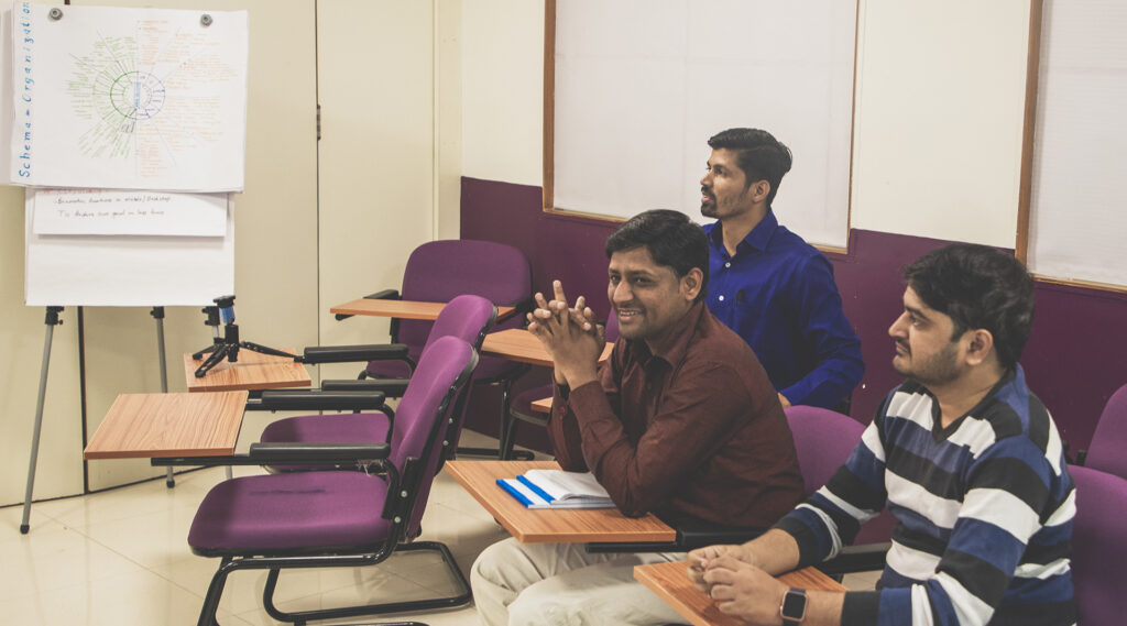
Every Wednesday afternoon at Silicus has its own quiet energy. Laptops close a little earlier, coffee cups refill a little more often, and the room slowly shifts from delivery mode to learning mode.
This is our space for team bonding, open conversations, and—most importantly—knowledge sharing.
Last Wednesday was special for me.
I had the opportunity to transfer learnings from my HFI (Human Factors International) study to our UI/UX team, using a real, close-to-home problem:
Redesigning Silicus’s Internet Portal for a better employee experience.
What followed wasn’t a lecture.
It was a shared exploration of how strategy, structure, and empathy come together to create meaningful digital experiences.


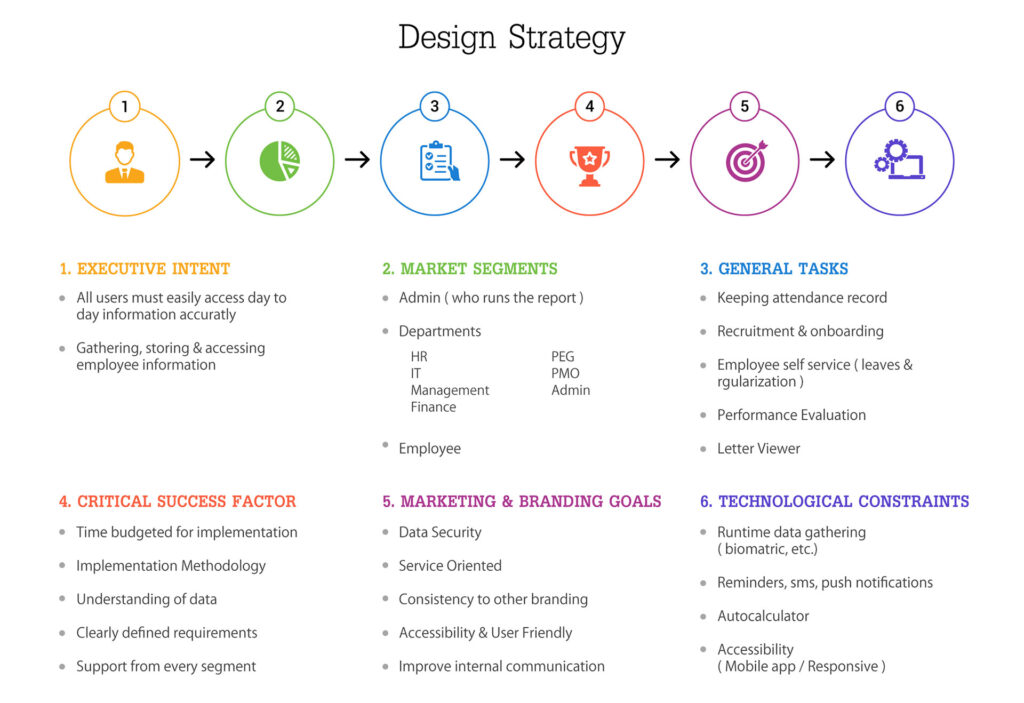
Why Start With Design Strategy?
Before screens, before components, before wireframes—we started with intent.
Design Strategy helped us align on one simple question:
What should the portal enable employees to do effortlessly, every single day?
From the discussions and visuals:
- Easy access to day-to-day information
- Accuracy and trust in employee data
- Reduced dependency on people for routine tasks
- A system that supports, not slows down
This step grounded everyone—designers, researchers, and thinkers—on the “why” before the “how.”
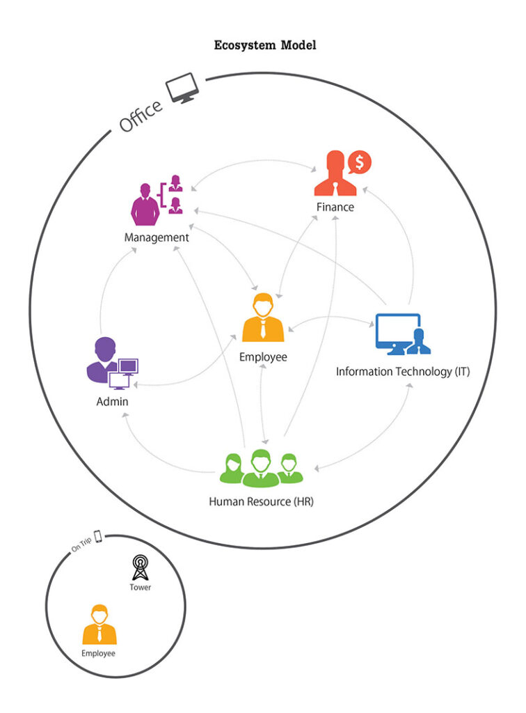
Seeing the Whole Picture Through the Ecosystem Model
Once intent was clear, we zoomed out.
The Ecosystem Model became our shared lens to understand how:
- Employees
- HR
- Finance
- IT
- Admin
- Management
…interact with each other through the portal.
What worked beautifully here was realising that:
- No role exists in isolation
- Every action triggers another dependency
- A small UX decision in one module can ripple across departments
This model helped the team design connections, not just interfaces.

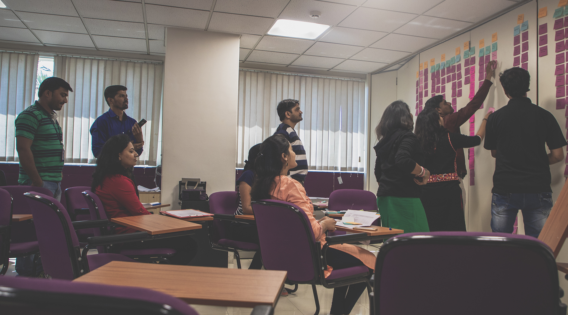
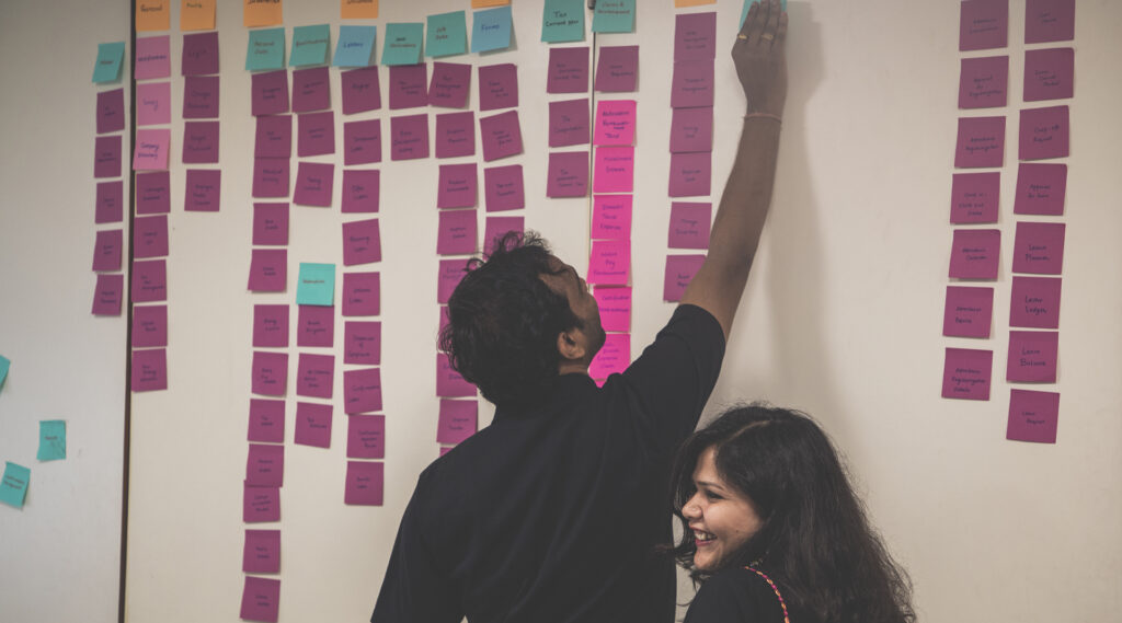
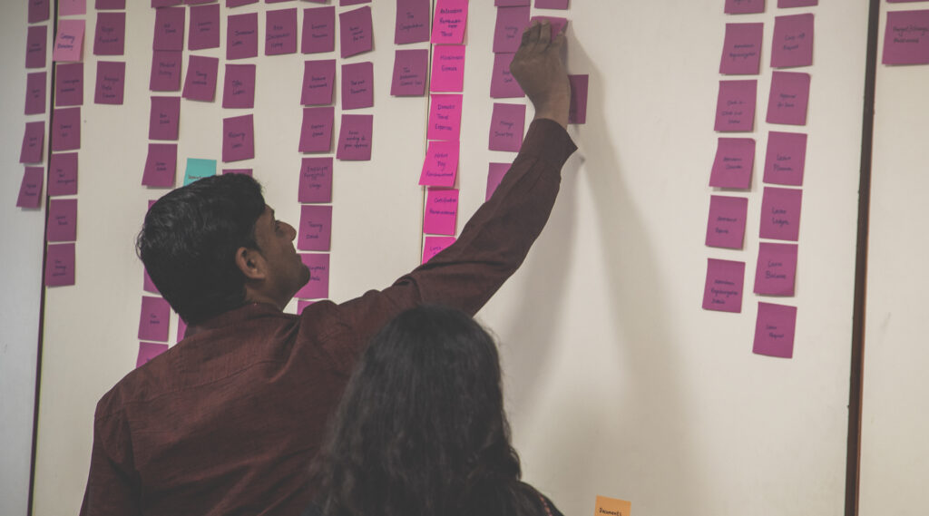
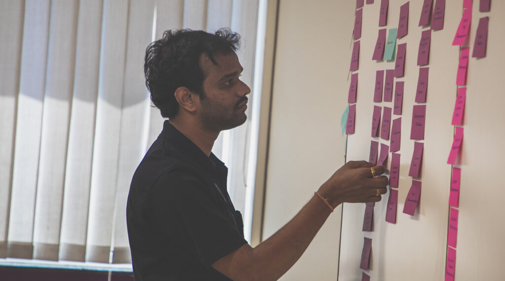
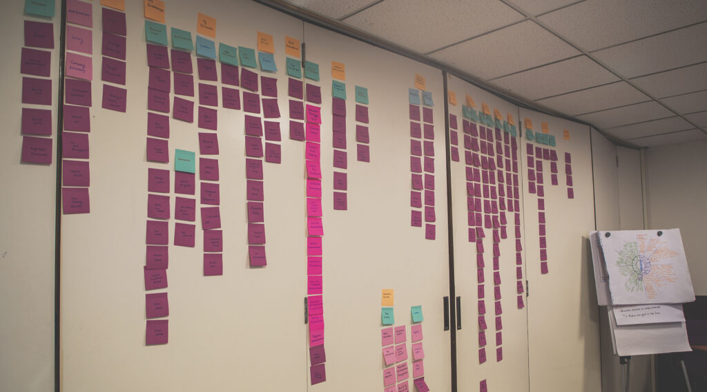
Making Sense of Complexity With Card Sorting
Then came one of my favourite parts—Card Sorting.
We used it as a collaborative exercise to:
- Break down features
- Question assumptions
- Group contentin the way users naturally think
This step sparked great conversations:
- “Does this belong to HR or the employee?”
- “Is this a task or information?”
- “Would I search for this, or expect it upfront?”
Watching the team debate, rearrange, and rethink was a reminder that clarity is designed, not assumed.

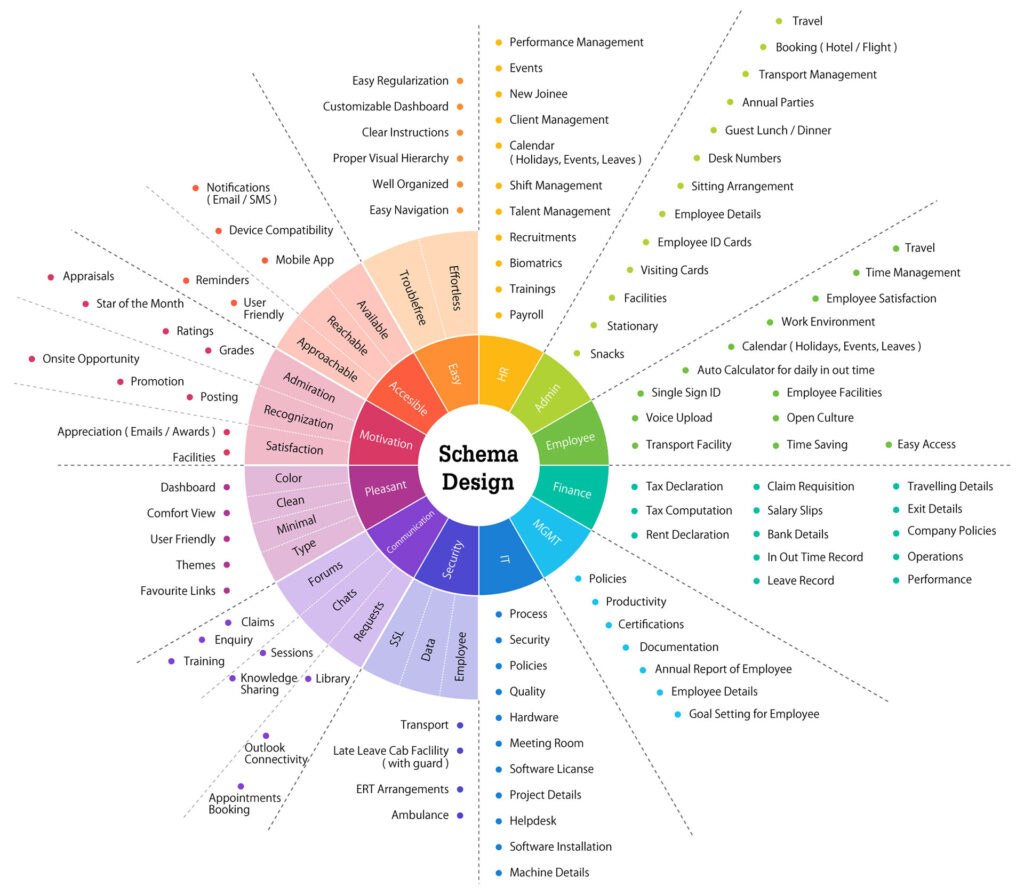
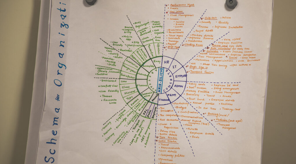
Schema Design: The Invisible Backbone
If Design Strategy is the vision, Schema Design is the skeleton.
Using the schema model, we explored:
- How information should be structured
- How features relate to emotions like motivation, accessibility, and trust
- How visual hierarchy supports faster decision-making
This is where UX quietly does its most powerful work—
making complexity feel simple, and systems feel human.
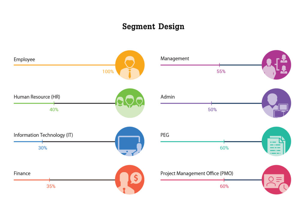
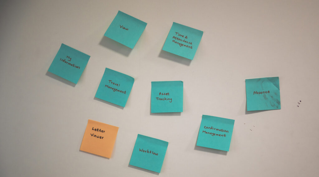
Segment Design: Designing for Everyone, Not Everything
One portal. Many users.
With Segment Design, we mapped:
- Employee
- HR
- Admin
- IT
- Finance
- Management
- PMO / PEG
Each has different access levels, needs, and priorities.
The key learning here:
Great UX doesn’t give everyone everything.
It gives everyone exactly what they need.
This clarity helps reduce noise, improve speed, and increase adoption.

More Than a Session—A Culture
What made this session truly rewarding wasn’t the slides or diagrams.
It was the participation.
Questions, reflections, disagreements, smiles, and shared “aha” moments filled the room.
And soon, the training photos of teammates captured what matters most—a team growing together.
These Wednesday sessions remind me that:
- Knowledge grows when shared
- UX maturity grows when teams think together
- Culture is built in moments like these
A Small Reflection
Designing an internal portal may not sound glamorous.
But when done right, it directly impacts:
- Productivity
- Trust
- Satisfaction
- Everyday work-life for employees
And that makes it one of the most meaningful UX challenges to solve.
If you’re part of a team that learns together every week—protect that time.
It’s where better designers, better systems, and better experiences are born.What’s the most impactful UX discussion you’ve had with your team recently?