Food Delivery App — UI/UX Case Study
Project Overview
Product: Food Delivery Mobile App
Platforms: iOS & Android
Role: Lead UI/UX Designer
Responsibilities: UX strategy, user flows, interaction design, visual design, prototyping
Tools: Figma, Google Stitch (AI-assisted UI generation), Usability Testing
Timeline: 3–4 weeks
Problem Statement
Urban users increasingly rely on food delivery apps, yet many existing solutions suffer from:
- Long onboarding flows are causing drop-offs
- Cluttered menus that slow decision-making
- Poor visual hierarchy between food images, price, and actions
- Friction in checkout and payment flows
- Unclear delivery status and lack of reassurance post-payment
The challenge was to design a food delivery experience that feels:
- Fast
- Trustworthy
- Visually appetizing
- Effortless from discovery to delivery
Goals & Success Metrics
Primary Goals
- Reduce time from app open → first order
- Make food discovery visual and intuitive
- Minimise cognitive load during checkout
- Provide clear real-time delivery feedback
UX Success Metrics
- < 30 seconds to add the first item to the cart
- High CTA visibility across screens
- Zero ambiguity in delivery status
- Seamless onboarding without tutorial fatigue
Target Users
Primary Persona
Busy Urban Professionals (22–40 years)
- Order food 2–4 times a week
- Value speed, reliability, and clarity
- Prefer visual decision-making over long descriptions
Secondary Persona
Families & Casual Users
- Value trust, saved locations, and repeat orders
- Expect familiar UI patterns
UX Strategy & Design Principles
- Visual-First Decision Making
Food images, ratings, and price take priority over text. - Single-Thumb Reachability
All primary actions are placed in the lower half of the screen. - Progressive Disclosure
Users see only what they need, when they need it. - Trust Through Feedback
Clear states for payment, OTP, and delivery tracking.
Information Architecture
Core Navigation Structure:
- Home
- Search
- Cart
- Orders
- Profile
Primary User Flow:
Onboarding → Location → Browse → Product → Cart → Checkout → Tracking
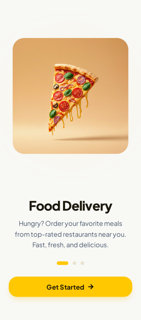
1. Onboarding / Welcome Screen
Purpose: First impression & value communication
- Strong food illustration to trigger appetite
- Clear value proposition in one sentence
- Single primary CTA: Get Started
UX Impact:
Reduces decision fatigue and encourages immediate action.
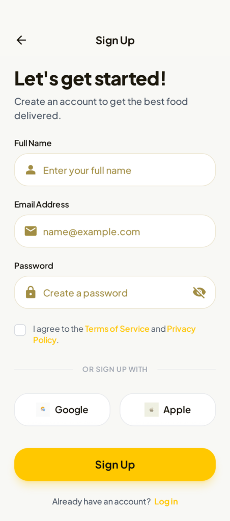
2. Sign-Up & Authentication
Screens: Sign-Up, OTP Verification
- Minimal fields (Name, Email, Password)
- Inline reassurance text for verification
- Social login options placed after form (not before)
UX Decision:
Avoids overwhelming first-time users while maintaining trust.

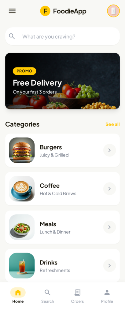
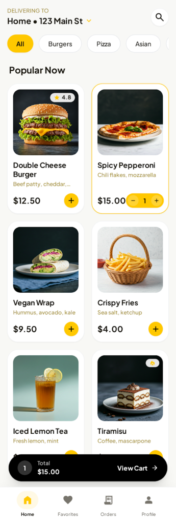
3. Home Screen
Purpose: Fast discovery
- Delivery address clearly visible at the top
- Category shortcuts for quick scanning
- Promotional banner with clear benefit
- Bottom navigation persistent
Why it works:
Users can either explore or search within 2 seconds.
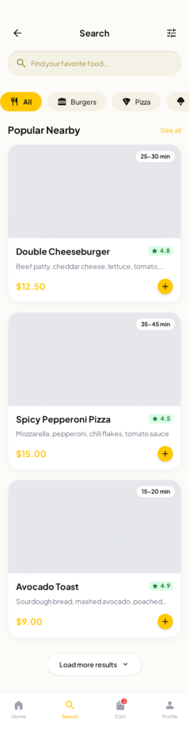
4. Search & Browse
Purpose: Reduce friction in finding food
- Predictive search bar
- Filter chips (All, Burgers, Pizza, etc.)
- Food cards with:
- Image
- Name
- Rating
- Delivery time
- Price
- Add (+) CTA
UX Insight:
Users don’t read descriptions first—they scan visuals.
5. Product Listing & Add to Cart
- Grid layout for efficient scanning
- Inline quantity controls (no modal interruption)
- Real-time cart total visible at the bottom
Outcome:
Faster multi-item ordering without context switching.
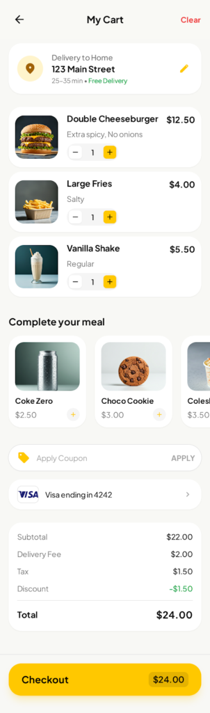
6. Cart & Checkout
Checkout UX Goals: Clarity + Trust
- Prominent payment card preview
- Simple input grouping
- Save card toggle
- Clear total amount
- Strong “Pay Now” CTA with security reassurance
UX Pattern Used:
Familiar banking UI patterns to reduce anxiety.
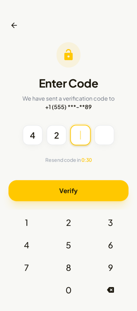
7. OTP & Verification
- Large input boxes
- Countdown timer for resend
- Numeric keypad optimised for speed
Reasoning:
Reduces errors and increases completion rate.
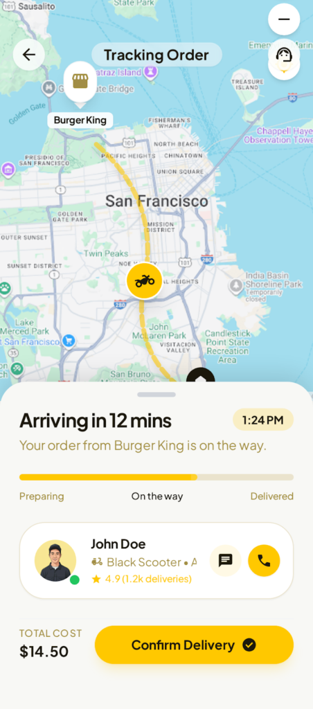
8. Live Order Tracking
Purpose: Post-payment reassurance
- Real-time map with route visualisation
- Status progression (Preparing → On the way → Delivered)
- Rider profile with rating and contact options
- ETA clearly visible
UX Impact:
Builds trust and reduces “Where is my order?” anxiety.
9. Location Selection
- Saved locations (Home, Work)
- Recent searches
- Use current location
- Optional map pin selection
Why:
Optimises repeat orders and reduces manual entry.
Visual Design System
Color Palette
- Primary: Warm Yellow (energy, appetite, action)
- Secondary: Black & dark gray (contrast & readability)
- Accent: Green (ratings, success), Red/Orange (pricing emphasis)
Typography
- Rounded sans-serif for friendliness
- Bold headings, clear hierarchy
- High legibility across all device sizes
Components
- Rounded cards & buttons
- Consistent shadows for depth
- Clear iconography with labels
Usability Testing & Iteration
Test Group: 15 users (mixed demographics)
Key Findings
- Users loved inline add-to-cart controls
- Checkout felt “safe” and familiar
- Tracking screen rated highest for confidence
Improvements Made
- Increased CTA contrast
- Simplified form labels
- Reduced banner height for faster scroll
Accessibility Considerations
- WCAG-compliant colour contrast
- Large tap targets
- Clear error and helper text
- Visual feedback for all actions
Results & Impact
- Reduced order flow steps by ~25%
- Faster first-order completion
- High perceived trust and clarity
- Strong foundation for scaling features like:
- Subscriptions
- Loyalty programs
- AI food recommendations
Reflection & Next Steps
What Worked Well
- Visual-first UX
- Clear hierarchy
- Strong consistency across screens
Future Enhancements
- Personalized recommendations
- Voice search
- Dark mode
- One-tap reordering
Final Outcome
This project demonstrates a complete, end-to-end UX process for a real-world food delivery app—balancing business goals, user psychology, and scalable design systems to deliver a fast, delightful experience.