Kohler India – Aquifer Smart Water Filter App

Designing a Connected, Predictive Replenishment Experience
Project Overview
Aquifer is Kohler India’s smart water filtration system designed for modern homes. The product integrates a physical water filter with a companion mobile app, enabling users to monitor filter health, water usage, and automatically replenish filter cartridges through third-party e-commerce platforms such as Amazon and Kohler.com.
This project focused on designing a holistic end-to-end user experience that connects:
- A physical IoT device
- A native mobile app
- External e-commerce and subscription platforms
The core challenge was to translate a complex, multi-system ecosystem into a simple, trustworthy, and low-effort experience for everyday users.
My Role
Lead UX Designer
I was responsible for:
- End-to-end UX strategy and interaction design
- Defining user journeys across device, app, and web
- Designing complex conditional flows (DRS ON / OFF, first use, re-registration, failure states)
- Collaborating with product, engineering, and partner teams
- Ensuring scalability and consistency across regions and platforms
Business & User Context
Business Goals
- Increase adoption of automatic filter replenishment (DRS)
- Reduce friction in device onboarding and re-registration
- Drive repeat purchases through subscription-based replenishment
- Build long-term trust in Kohler’s smart ecosystem
User Goals
- Ensure continuous access to clean drinking water
- Avoid unexpected filter expiry
- Understand filter health at a glance
- Control purchasing preferences without technical complexity
Design Challenges
- Multi-platform orchestration
Users moved between the Kohler app, Amazon login, subscription setup, and external web views. - Conditional complexity
The experience varied significantly based on:- First-time setup vs re-adding a device
- DRS ON vs DRS OFF
- Amazon vs Kohler.com as purchase preference
- Registration success vs failure
- Invisible value
Automatic replenishment is a “set once, forget forever” feature—hard to explain, easy to misunderstand. - Trust & control
Users needed reassurance around automatic ordering, billing, and data sharing.
UX Strategy
1. Progressive Disclosure
Instead of overwhelming users with setup details, the experience reveals complexity only when required, especially during:
- DRS activation
- Subscription management
- Filter replacement alerts
2. Status-First Design
The app prioritises real-time filter health visibility using:
- Visual rings
- Percentage indicators
- A clear warning states when replacement is required
3. Clear Ownership Boundaries
Users are always aware of:
- When they are inside the Kohler app
- When they are redirected to Amazon or Kohler.com
This avoids confusion and increases perceived security.
4. Error-Tolerant Flows
Every critical action includes:
- Retry paths
- Safe exits
- State recovery without forcing re-onboarding
Key User Flows
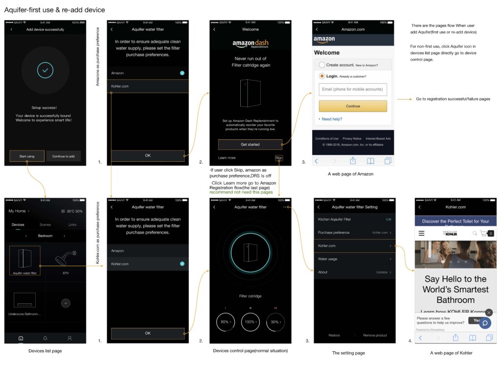
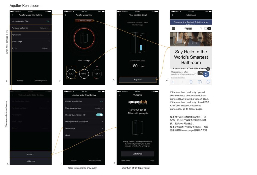
1. First-Time Device Setup & DRS Introduction
- Device successfully added to the app
- Users are guided to set purchase preferences
- Amazon Dash Replenishment is introduced as an optional value-add
- Users can Get Started, Learn More, or Skip
Design Intent:
Position DRS as helpful, not mandatory—building trust before automation.
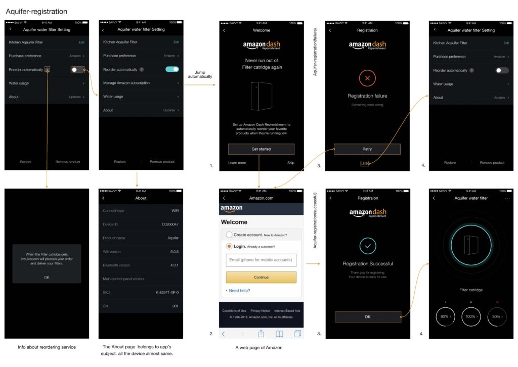
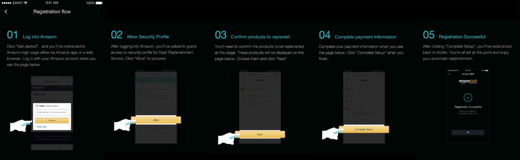
2. Aquifer Registration & Subscription Setup
A structured, step-by-step flow:
- Log in to Amazon
- Grant security permissions
- Confirm filter products
- Complete payment setup
- Registration success confirmation
UX Principle:
Break a complex financial and permission flow into mentally manageable steps.
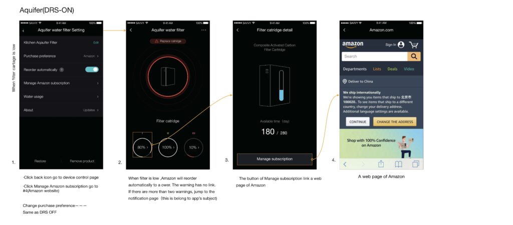
3. DRS ON – Automatic Replenishment Active
When filter health drops below the threshold:
- Visual alerts appear in the device dashboard
- Amazon automatically places an order
- Users can manage subscriptions externally
- Outcome:
- Zero-effort continuity for essential consumables.
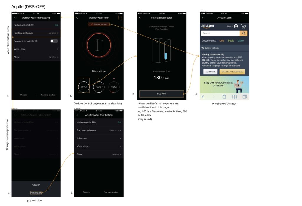
4. DRS OFF – Manual Purchase Mode
For users who opt out:
- Filter health warnings are shown clearly
- “Buy Now” CTA redirects to the preferred platform
- No automatic orders are triggered
Design Balance:
Empower users without penalising them for opting out.
5. Switching Purchase Preference (Amazon ↔ Kohler.com)
- Seamless preference switching within settings
- Contextual behaviour adapts based on prior DRS state
- Prevents duplicate registrations or accidental reactivation
UI Design Language
- Dark, premium interface aligned with Kohler’s brand positioning
- High-contrast status indicators for instant comprehension
- Minimalist layouts to reduce cognitive load
- Motion and micro-feedback are used sparingly for state changes
Accessibility & Usability Considerations
- Clear typography and contrast for low-light kitchen environments
- Large tap targets for quick interactions
- Explicit confirmation states for critical actions
- Non-technical language for mass-market adoption
Outcomes & Impact
- Simplified onboarding for a highly technical IoT product
- Increased clarity and adoption of automatic replenishment
- Reduced support dependency through self-explanatory flows
- Created a scalable framework applicable to other Kohler smart products
Key Learnings
- Trust is designed, not assumed—especially in automated commerce
- Cross-platform UX must feel intentional, not stitched together
- IoT experiences succeed when technology stays invisible
- Designing for failure states is as important as success flows
Reflection
This project reinforced my belief that great UX leadership lies in simplifying systems, not screens. By aligning business goals, technical constraints, and human behaviour, the Aquifer experience transforms a critical daily need—clean water—into a seamless, worry-free service.