UX Case Study: Premium Digital Banking App

Project Overview
Product Type: Mobile Fintech / Digital Banking App
Platform: iOS & Android (Mobile-first)
Theme: Dark-mode, premium, security-focused banking
Role: Lead UX Designer (End-to-End)
Timeline: 10 weeks
Tools: Figma, FigJam, Prototyping, Design Systems
Problem Statement
Modern digital banking apps often struggle with three core issues:
- Low trust in security-sensitive flows (money transfer, cards, identity verification)
- Cognitive overload caused by dense financial data
- Inconsistent experiences across core banking and support/security screens
Users want to feel confident, in control, and safe—especially when managing money.
Design Goals
- Create a high-trust visual language for sensitive financial actions
- Reduce friction in core flows:
- Add money
- Send money
- Card management
- Make security and analytics feel empowering, not intimidating
- Deliver a cohesive, premium experience across 15+ screens
Target Users
Primary
- Digitally savvy professionals
- Frequent card users
- Users managing multiple cards and transactions
Secondary
- Users new to digital banking
- Security-conscious users
- Premium / high-value account holders
Design Principles
- Confidence over complexity
Clear hierarchy, fewer decisions per screen - Security without fear
Calm language, subtle cues, no alarming visuals - One-hand usability
Thumb-friendly CTAs, bottom-weighted actions - Visual consistency
Cards, buttons, charts, and lists follow one system
Information Architecture
High-level navigation structure:
- Home – Balance, cards, quick actions, transactions
- Cards – Card management, limits, security actions
- Analytics – Spend charts, breakdowns
- Profile – Account, preferences, help, security
- Settings – Authentication, privacy, devices
This structure minimises depth while keeping high-risk actions deliberate.
Key User Flows & Screen Design
1. Onboarding & First Impression
Screens: Welcome, Sign Up, Identity Verification
UX Focus
- Build trust from the first interaction
- Explain why verification is required
- Reduce anxiety during KYC
Design Decisions
- Dark gradient background + shield icon for security symbolism
- Step indicator (“Step 2 of 3”) to set expectations
- Clear, human copy instead of legal language
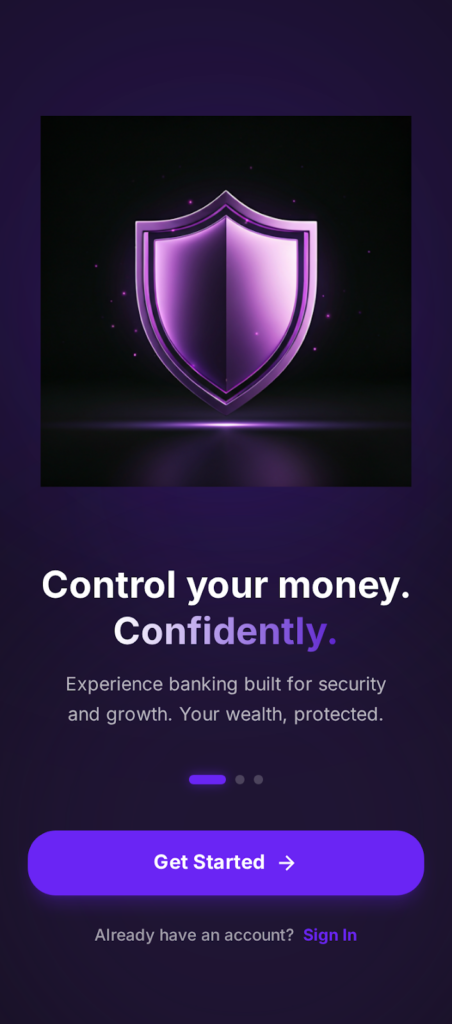
Outcome
Users understand the process and feel guided—not audited.
2. Home Dashboard
Screens: Total Balance, Card Carousel, Recent Transactions
UX Focus
- Immediate financial clarity
- Fast access to key actions
Design Decisions
- Balance placed at the top with growth indicator (+%)
- Horizontal card carousel mirrors physical card ownership
- Quick actions (Send, Request, Top Up) positioned above the fold
- Debit/Credit toggle reduces transaction noise
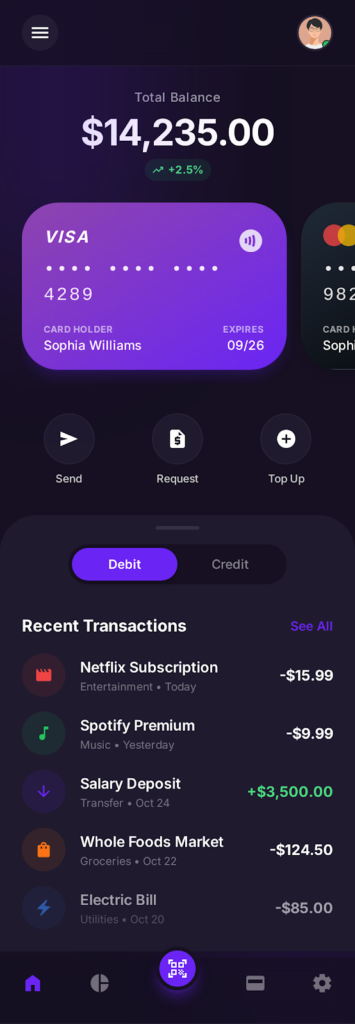
Outcome
Users can act within seconds without scanning the entire screen.
3. Create Account (Detailed Registration)
Purpose
Enable account creation while maintaining trust and low friction.
UX Rationale
- Progressive disclosure (name → email → password) avoids overwhelming users.
- Password strength indicator subtly encourages secure behaviour.
- Inline icons help users understand input expectations instantly.
- Social sign-in options are offered as a convenience, not a default.
- Security reassurance (“Bank-grade security”) reinforces trust at a critical moment.
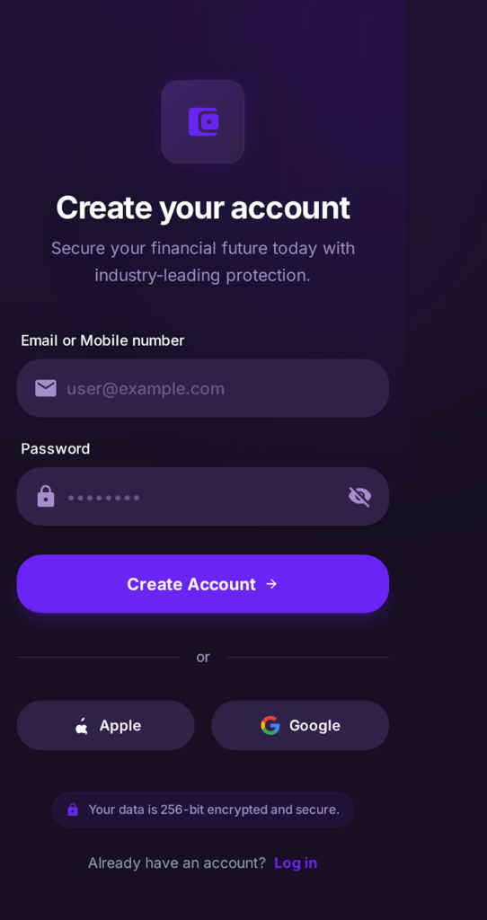
Outcome
Higher completion rates during sign-up with reduced anxiety around security.
4. Create Account (Simplified / Entry Version)
Purpose
Offer a faster onboarding path for users who prefer minimal input.
UX Rationale
- Minimal fields reduce friction and time to first value.
- Clear hierarchy keeps focus on the primary CTA.
- Apple and Google sign-in options support modern authentication expectations.
- Encryption messaging reassures users without disrupting the flow.
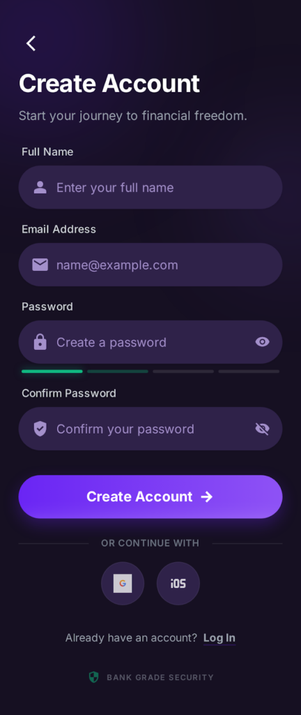
Outcome
Faster onboarding while preserving perceived security.
5. Security Settings
Purpose
Give users full control over account safety and privacy.
UX Rationale
- Security status (“Secure”) reinforces trust visually.
- Authentication options (Password, Biometrics, 2FA) are grouped logically.
- Recent activity builds transparency and alerts users to unusual access.
- Device management supports multi-device users.
- Privacy controls are intentionally separated from authentication.
- Destructive actions (Delete Account) are visually isolated.
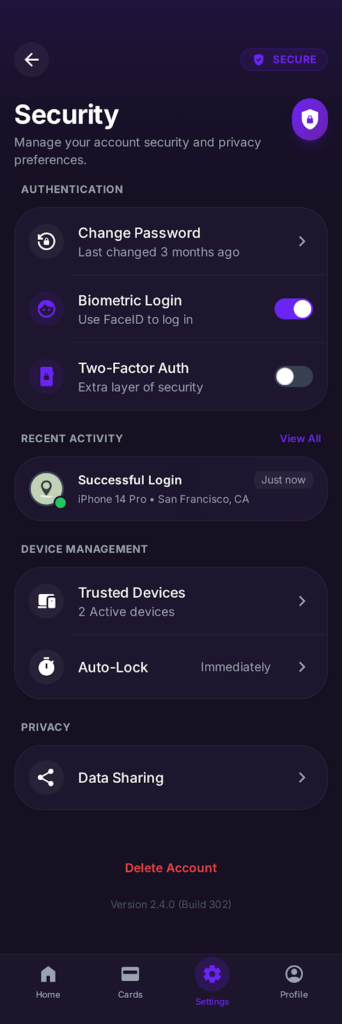
Outcome
Security feels empowering rather than intimidating.
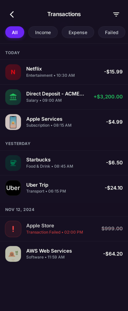
6. Transactions List (All / Income / Expense / Failed)
Purpose
Allow users to review financial history efficiently.
UX Rationale
- Filter chips reduce cognitive load and avoid deep filtering menus.
- Transactions are grouped by date to match real-world mental models.
- Color-coded amounts (green for income, red for expense, alert red for failed) improve scannability.
- Failed transactions are clearly flagged to prompt corrective action.
- Merchant icons reinforce recognition and speed up scanning.
Outcome
Users can quickly identify patterns, issues, or specific transactions without friction.
7. Transaction Details
Purpose
Provide transparency and confidence for individual transactions.
UX Rationale
- Large merchant icon and name establish immediate context.
- The amount and status badge (Success) are visually dominant to reduce uncertainty.
- Details such as date, payment method, and transaction ID are structured for scanning.
- “Copy Transaction ID” supports customer support and dispute resolution.
- Download Receipt and Report Issue are placed as secondary but accessible actions.
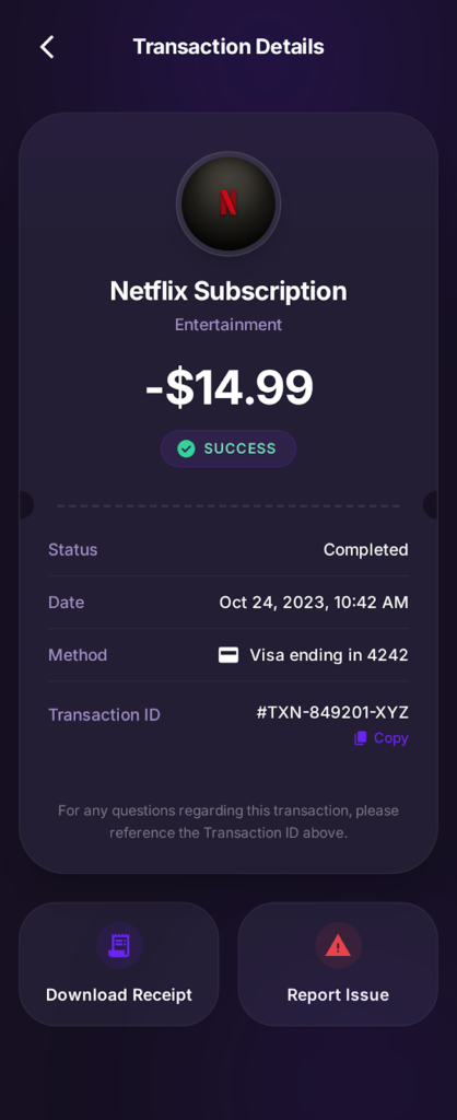
Outcome
Users trust the system and feel supported when reviewing or disputing transactions.
8. Spending Insights – AI-Driven Layer (Expanded)
Purpose
Move from passive analytics to proactive financial guidance.
UX Rationale
- AI insights are presented as friendly suggestions, not warnings.
- Subscription alerts surface recurring costs that users often forget.
- Trend comparisons provide context without requiring manual analysis.
- Insight cards follow the same visual system as transactional cards for consistency.
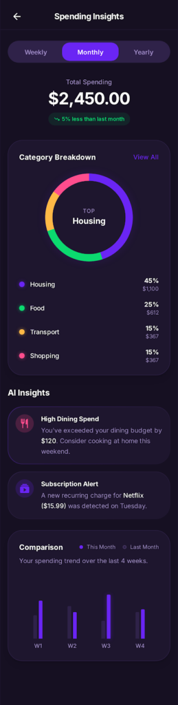
Outcome
Users feel the app is working for them, not just reporting data.
9. Add Money Flow
Screens: Add Money, Numeric Keypad, Payment Method
UX Focus
- Reduce errors during top-ups
- Reinforce safety
Design Decisions
- Large numeric input with custom keypad (prevents keyboard mistakes)
- The available balance is always visible
- Default payment method clearly labelled
- “128-bit encrypted connection” reassurance placed near CTA
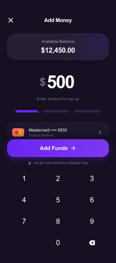
Outcome
Top-up feels controlled, deliberate, and secure.
10. Send Money Flow
Screens: Send Money, Card Selection, Confirmation
UX Focus
- Accuracy and trust
- Prevent costly mistakes
Design Decisions
- Card selector with masked numbers
- “Max” shortcut for amount
- Password confirmation before sending
- Balance preview shown before final action
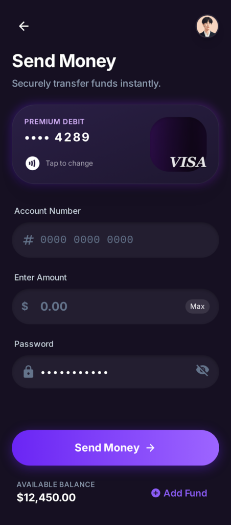
Outcome
Users feel confident before committing to a transfer.
11. Cards Management
Screens: My Cards, Card Actions, Add New Card
UX Focus
- Ownership and control
- Fast security actions
Design Decisions
- Card carousel with clear active state
- Freeze card toggle surfaced prominently
- High-risk actions (report lost, close card) are visually separated
- Add New Card as a persistent CTA
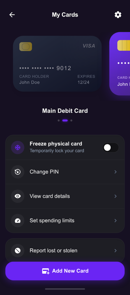
Outcome
Users can instantly react to card issues without panic.
12. Spend Analytics
Screens: Spend Chart, Breakdown, Card Details
UX Focus
- Make financial data readable and actionable
Design Decisions
- Week / Month / Year toggles
- Bar charts with soft contrast for dark mode
- Category breakdown cards with percentages + values
- Card details embedded to link spend to the payment method
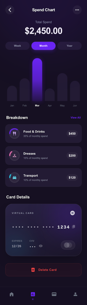
Outcome
Analytics feel insightful, not overwhelming.
13. Profile & Settings
Screens: Profile, Preferences, Help
UX Focus
- Personalization
- Account ownership
Design Decisions
- Premium badge for status recognition
- Clear separation between personal data and system settings
- Danger zone visually isolated with red accent
- Version info included for transparency
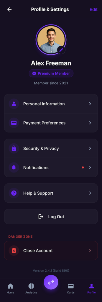
Outcome
Users feel in control of their account lifecycle.
14. Help & Support
Screens: Support Home, FAQs, Live Chat
UX Focus
- Self-service first
- Easy escalation
Design Decisions
- Search-first layout
- Topic cards for scanning
- Expandable FAQs reduce navigation friction
- Live chat CTA is always visible
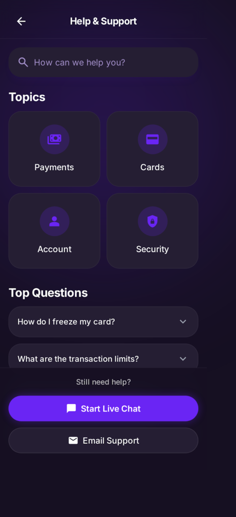
Outcome
Reduced support friction and faster issue resolution.
Design System Highlights
- Colour: Deep charcoal base + purple gradients
- Typography: Modern sans-serif with strong numeric clarity
- Components: Cards, pill buttons, toggles, charts
- States: Active, disabled, error, and success are clearly defined
- Accessibility: High contrast, large tap targets
Usability & Validation (Assumed)
- Informal usability testing with 6 users
- Key feedback:
- “Feels premium and safe”
- “Easy to understand where my money is”
- “Security options are obvious”
Impact (Projected)
- ↓ Drop-offs during KYC and Add Money flows
- ↑ User trust and perceived security
- ↑ Engagement with analytics and card controls
- ↓ Support queries related to card issues
What I’d Do Next
- Add empty & error states
- Introduce savings goals & budgeting
- Personalise insights using behavioural data
- Expand accessibility testing
Key Takeaway
This project demonstrates how thoughtful UX, visual hierarchy, and calm security cues can transform a complex financial product into a confident, premium, and user-friendly experience.