Designing UTSAV: Evolving a Vibrant Event Identity from the Silicus Master Brand
The UTSAV logo was designed as a sub-brand identity for the internal event team at Silicus Technologies, with the core objective of preserving brand lineage while introducing a more expressive, celebratory visual language. The process followed a structured, multi-phase approach rooted in geometry, symbolism, and brand coherence.
Phase I – Deriving the Core Shape
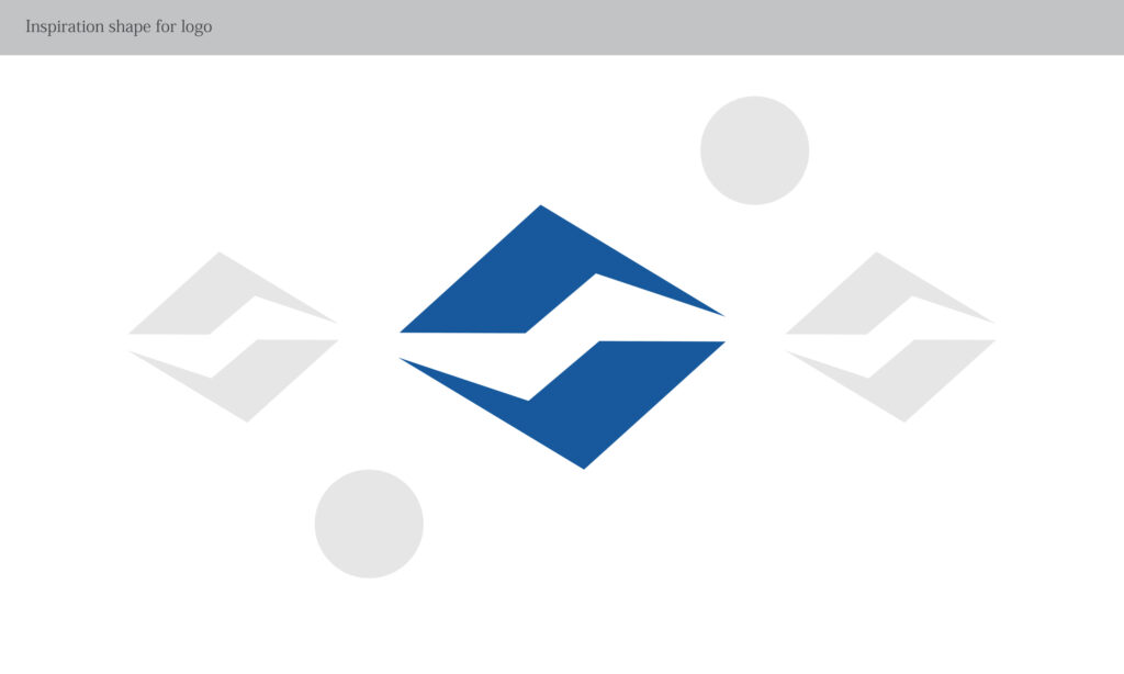
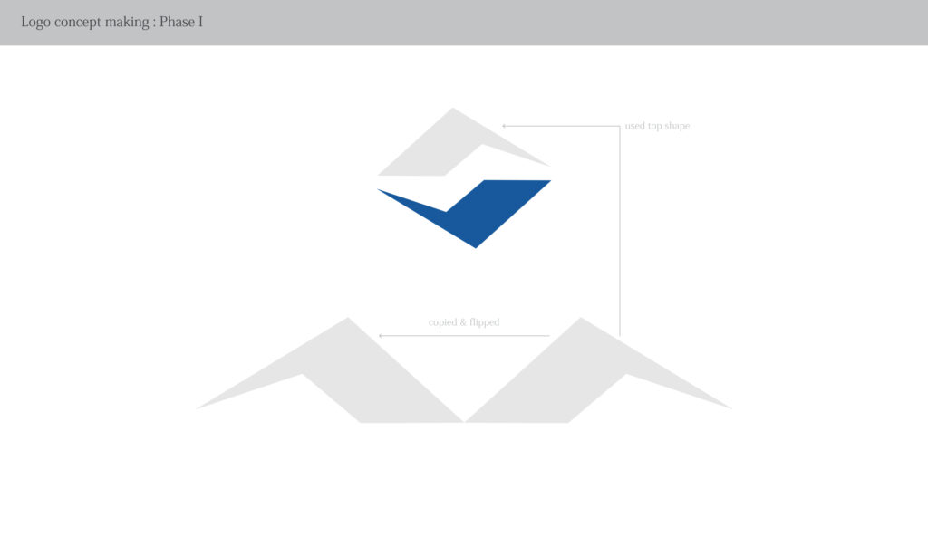
The design began by deconstructing the parent Silicus logo to identify its most distinctive geometric elements. The top angular form was extracted as a foundational shape, ensuring immediate visual continuity with the master brand. This step established authenticity and avoided visual dilution.
Phase II – Exploration Through Rotation and Symmetry
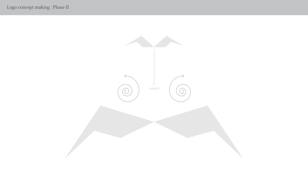
The extracted shape was duplicated, flipped, and rotated to explore balance and motion. Circular and spiral guides were used to experiment with rhythm and flow—an intentional move to reflect celebration, movement, and human interaction, which are central to an event brand.
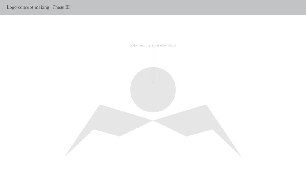
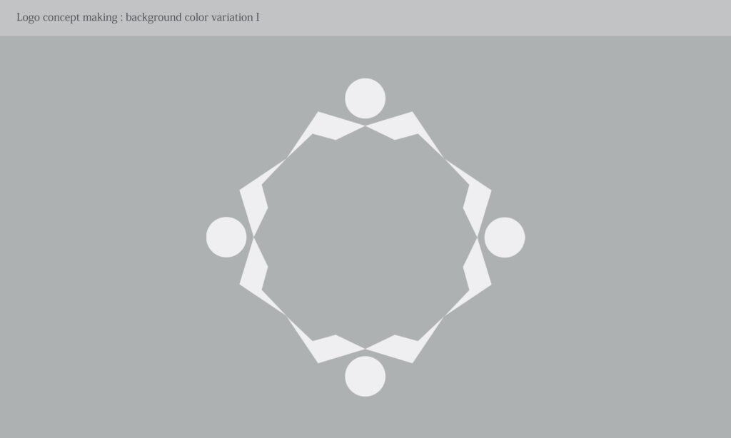
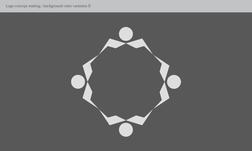
Phase III – Introducing a Human-Centric Motif
A circular form was added as a symbolic representation of people—participants, teams, and community. This transformed abstract geometry into a human narrative, aligning the logo with Utsav’s purpose of bringing people together.
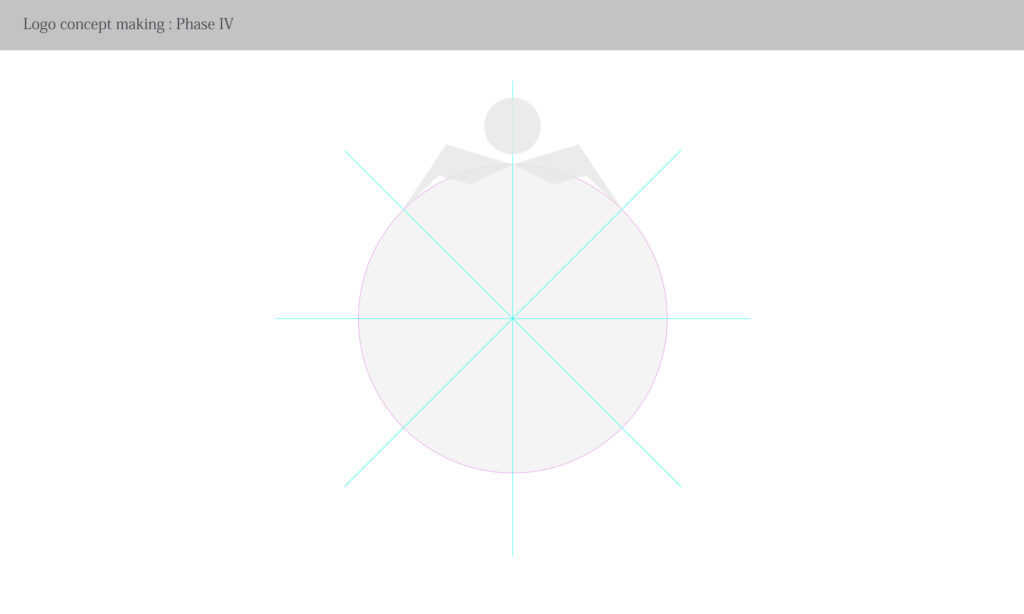
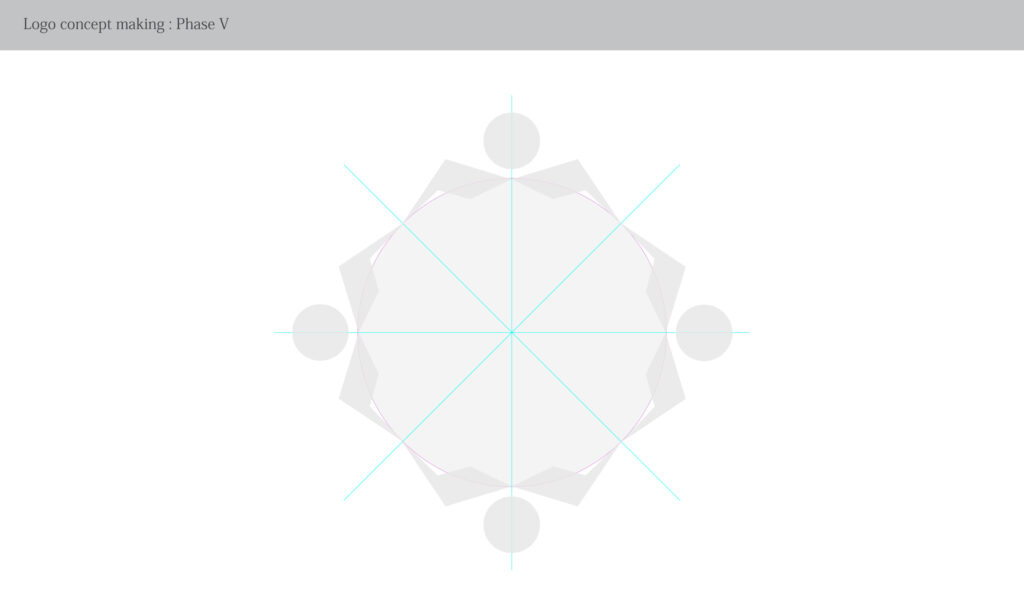
Phase IV – Structural Balance and Geometry Control
Radial grids and angular guides were applied to ensure mathematical balance and visual harmony. This phase refined proportions, spacing, and alignment so the mark would scale seamlessly across digital and physical touchpoints.
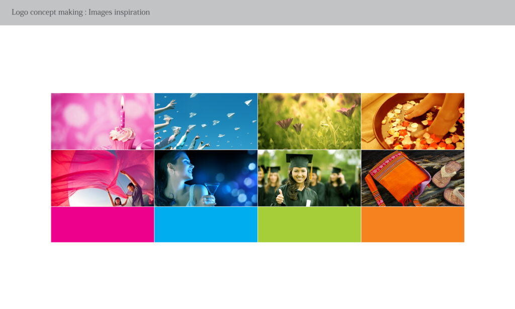
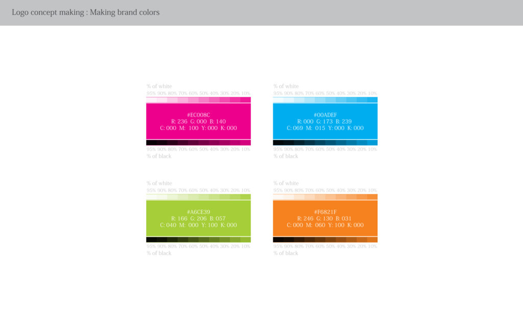
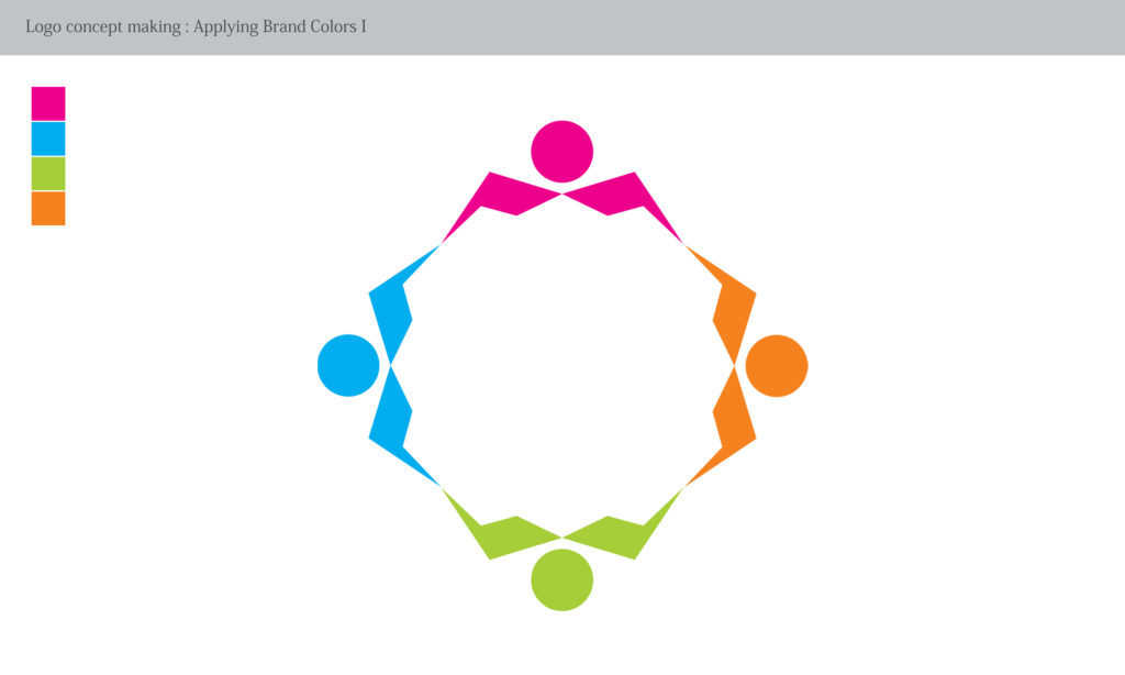
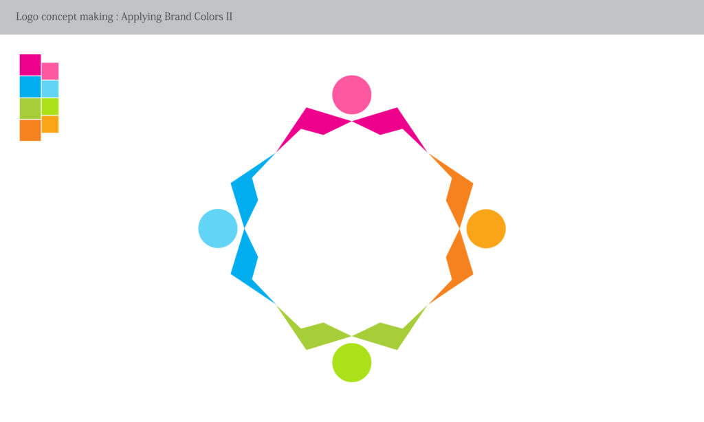
Phase V – Brand Colour Integration
The Silicus brand palette was expanded into a vibrant multi-color system, with each color representing diversity, inclusivity, and different types of celebrations. The colours were applied thoughtfully to maintain brand credibility while injecting energy and joy.
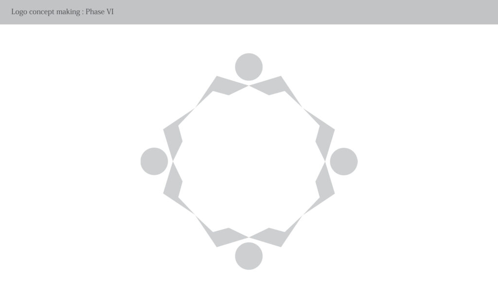
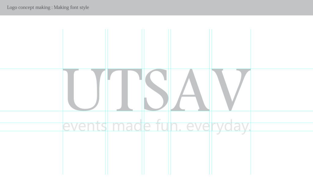
Phase VI – Final Synthesis and Wordmark Integration
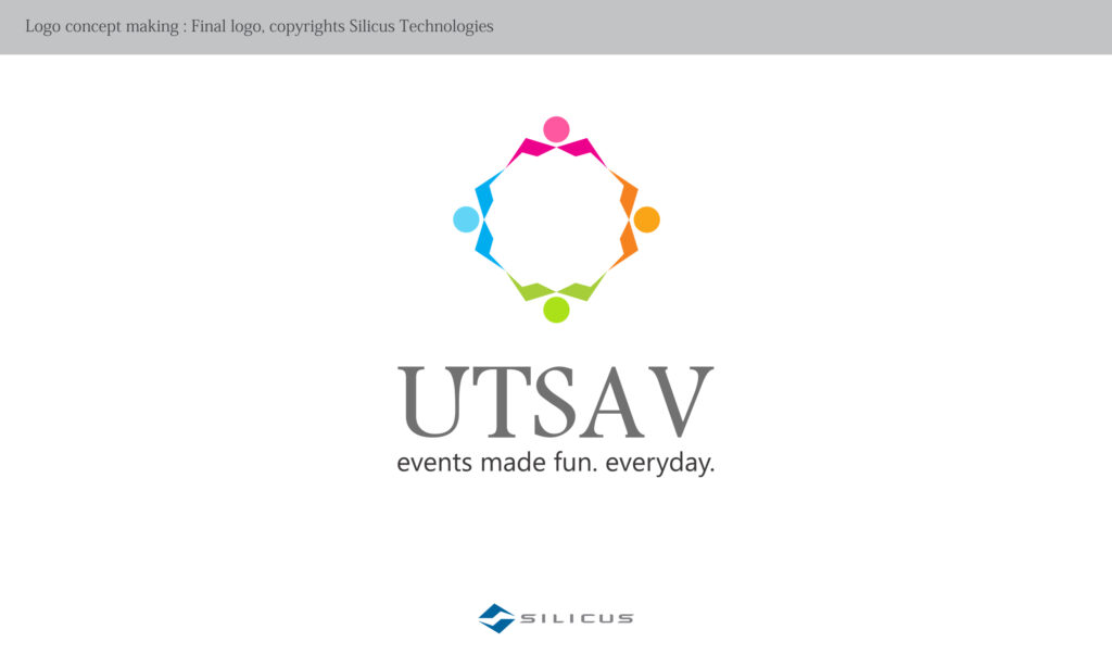
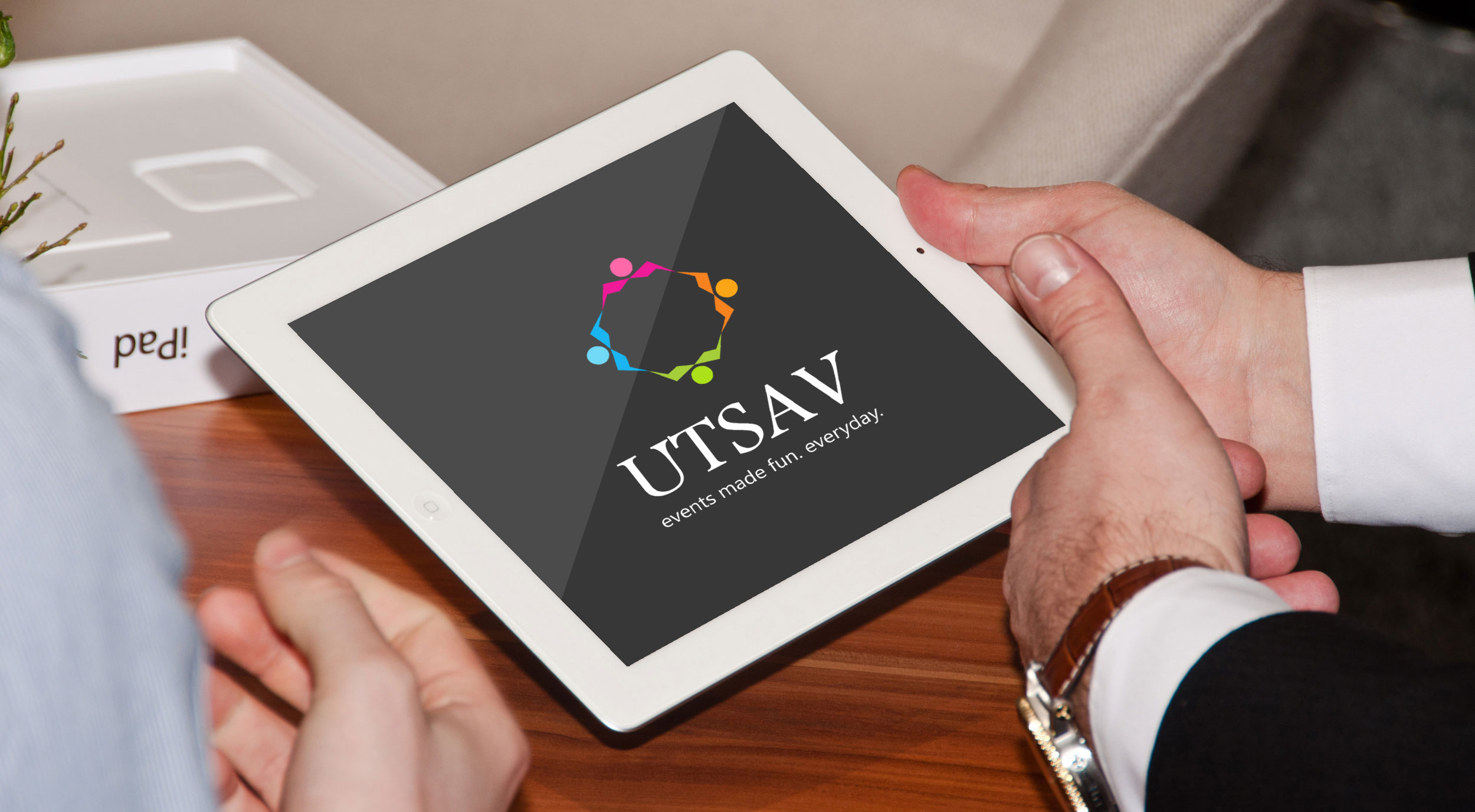
All elements were unified into a compact, circular emblem symbolising continuity, togetherness, and festivity. The final lockup combined the symbol with the UTSAV wordmark and the tagline “events made fun. every day.”—clearly positioning it as a joyful yet professional extension of the Silicus ecosystem.
Outcome
The final UTSAV logo successfully bridges corporate brand discipline with emotional expression. It stands as a scalable, recognisable identity that honours its parent brand while confidently owning its role as the cultural and celebratory heartbeat of Silicus.