
Enterprise Invoice Management Platform

Client: Silicus Technologies
Product: Enable (Web Application)
Role: Lead UX / UI Designer
Duration: Multi-phase enterprise rollout
1. Background & Context
Silicus needed a robust, scalable invoice and payment management platform to support new enterprise customers with complex billing models. The objective was to design Enable, a web-based system that could handle end-to-end project invoicing—covering invoices, payments, credits, write-offs, reporting, and deep administrative configuration—while remaining usable for finance, operations, and admin teams.
The challenge was not just visual design, but orchestrating complex financial workflows into an intuitive, auditable, and error-resistant user experience.
2. Problem Statement
Enterprise billing teams were struggling with:
- Fragmented invoicing and payment workflows
- High cognitive load while managing invoices, credits, and adjustments
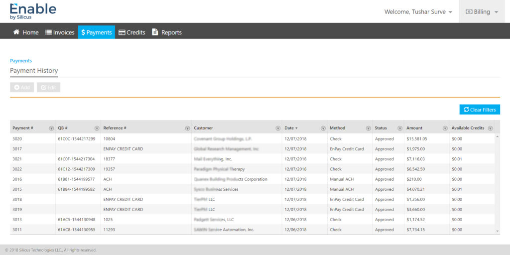
- Poor visibility into payment status, outstanding balances, and history
- Error-prone manual processes during invoice creation and payment application
- Complex system settings that were difficult to configure and audit
The business needed a single source of truth for invoicing that was secure, configurable, and scalable across customers and regions.
3. UX Goals & Success Criteria
Primary UX goals
- Simplify complex financial workflows without reducing flexibility
- Ensure accuracy, traceability, and compliance in invoicing operations
- Enable fast task completion for finance and billing users
- Design for role-based access and administrative control
Success metrics
- Reduced invoice creation and payment processing time
- Lower error rates in payment applications and credits
- Improved adoption across finance, admin, and leadership users
- Clear audit trails for all financial actions
4. Users & Personas
- Billing Executives – Create invoices, apply payments, manage credits
- Finance Managers – Monitor balances, approvals, and reconciliation
- Administrators – Configure system rules, currencies, workflows, and roles
- Leadership – Review reports, margins, and financial health
Each persona had different priorities, so the UX had to support depth without overwhelming the interface.
5. Key UX Challenges
- Designing form-heavy experiences without fatigue
- Supporting multiple billing scenarios (subscriptions, engagements, time-based billing)
- Ensuring data accuracy while editing invoices and payments
- Making administration powerful but safe
- Maintaining consistency across invoices, payments, credits, and reports
6. UX Strategy & Design Approach
a. Information Architecture
- Clear separation of Billing, Administration, and Reporting
- Persistent top navigation for primary billing actions (Invoices, Payments, Credits, Reports)
- Left navigation for deep admin configuration
b. Workflow-First Design
Each core task was mapped end-to-end before UI design:
- Create invoice → review → approve → sync → apply payment → audit
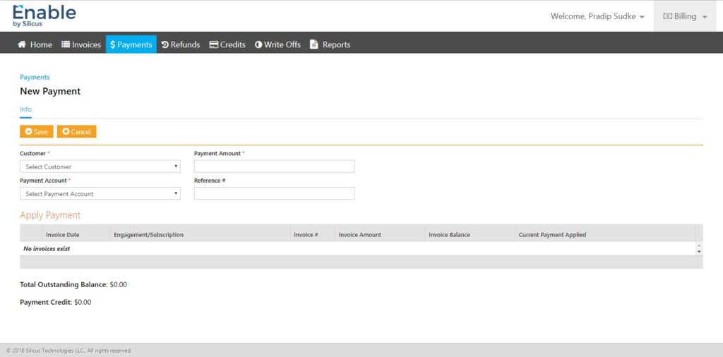
- New payment → apply to invoices → manage remaining credits
- Admin setup → system rules → user roles → workflow enforcement
This ensured screens reflected real operational flow, not just data structures.
7. Key UX Solutions
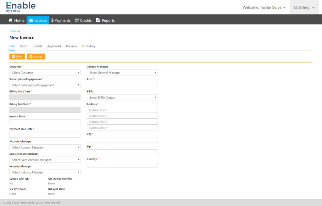
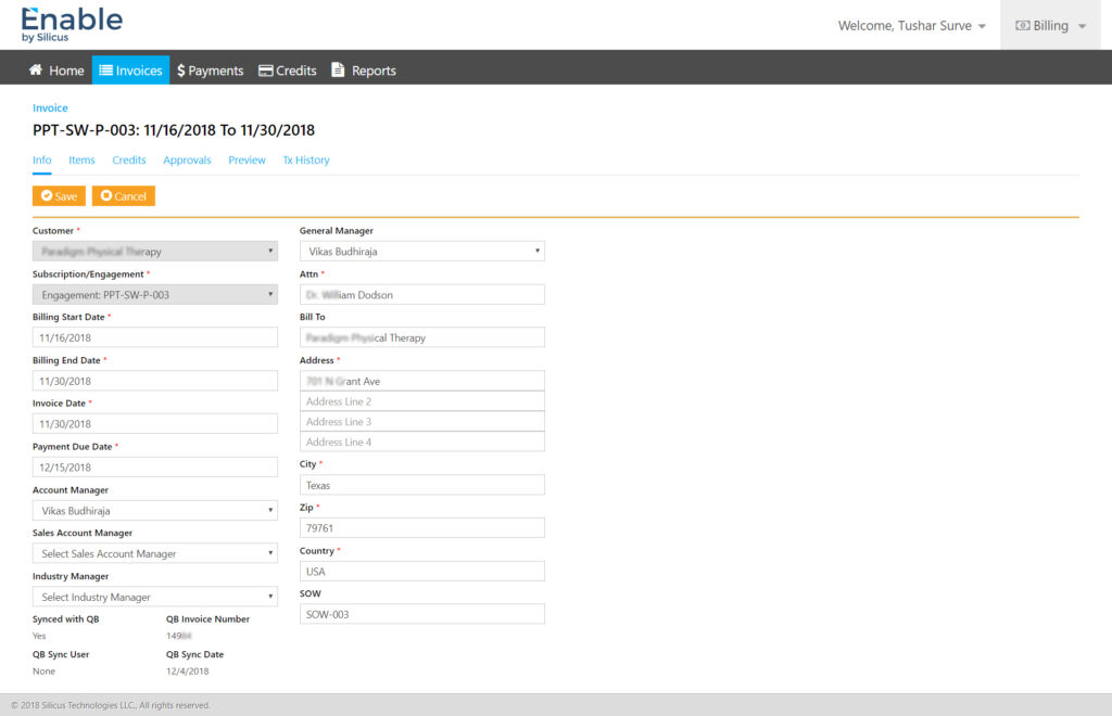
7.1. Invoice Creation & Management
- Structured, two-column layout for faster scanning
- Logical grouping of customer, billing period, and financial data
- Clear validation and mandatory field indicators
- Tabs for Info, Items, Credits, Approvals, Preview, and History to reduce clutter
Impact: Faster invoice creation with fewer errors.
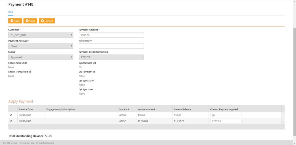
7.2. Payment Application Flow
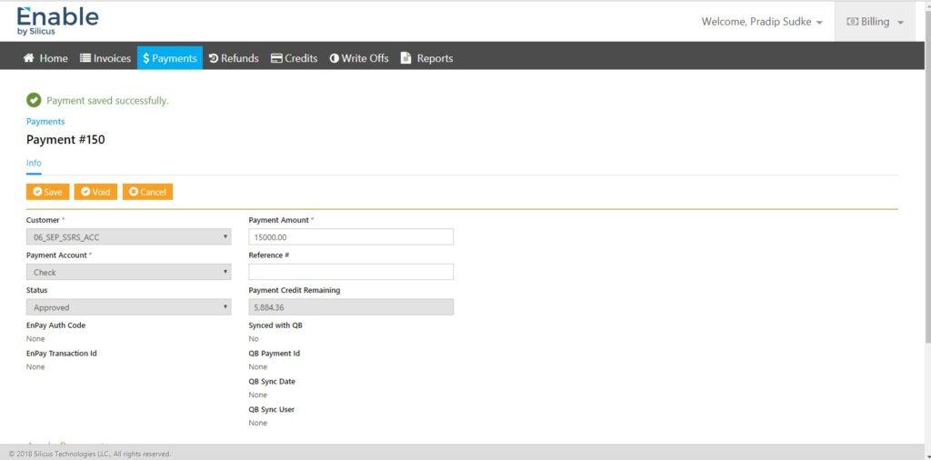
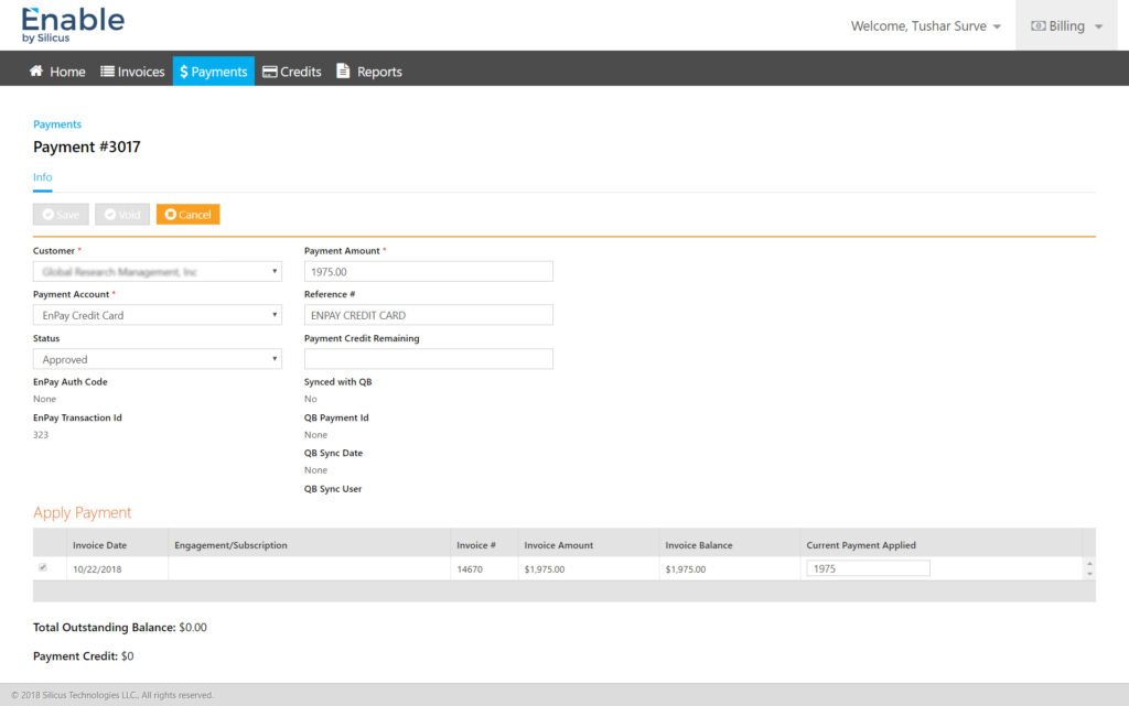
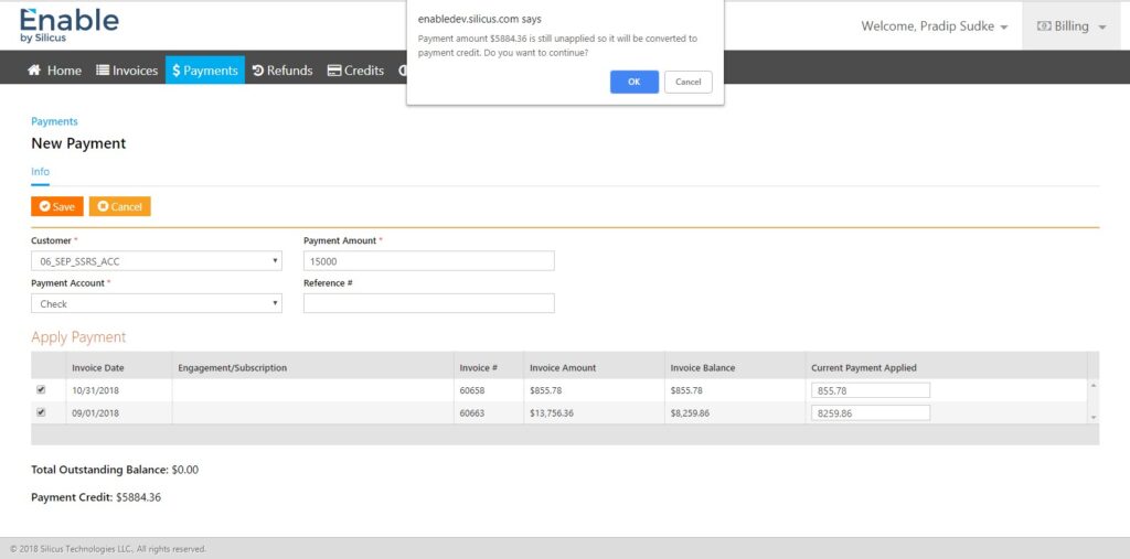
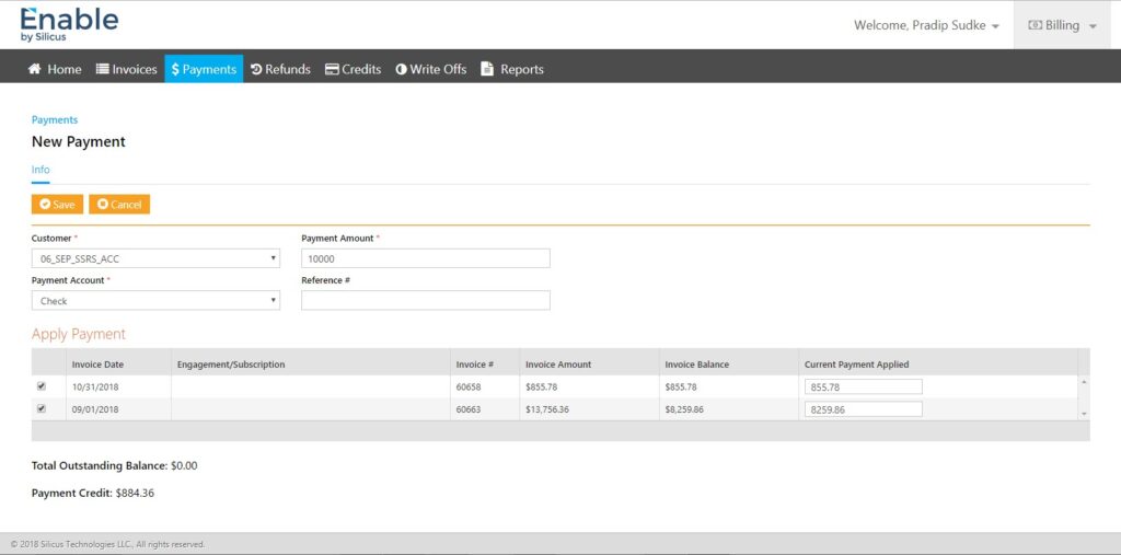
- Single screen to capture payment details and apply against invoices
- Real-time calculation of outstanding balance and remaining credit
- Visual confirmation states for successful payment actions
Impact: Reduced reconciliation errors and improved user confidence.
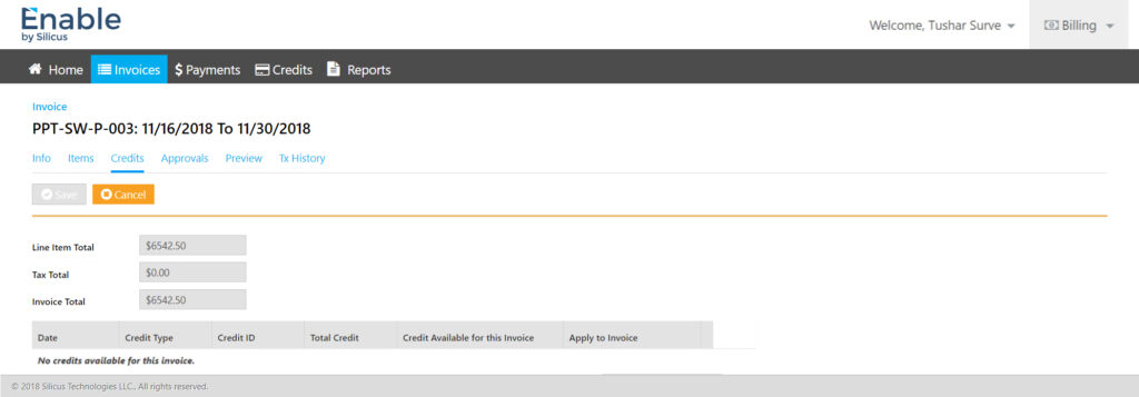
7.3. Credits & Adjustments
- Transparent credit availability per invoice
- Explicit “apply credit” interactions to prevent accidental deductions
- Clear visibility of credit history and usage
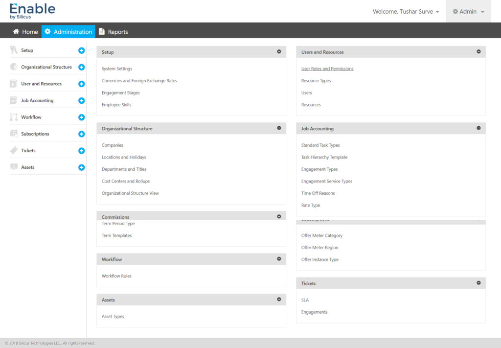
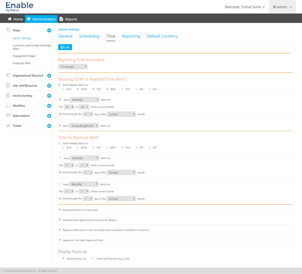
7.4. Administrative Configuration
- Modular admin dashboard grouping system settings logically
- Editable vs read-only states to prevent accidental changes
- Support for currencies, exchange rates, workflows, roles, and alerts
Impact: Enabled enterprise-grade customisation without UX debt.
7.5. Reporting & Visibility
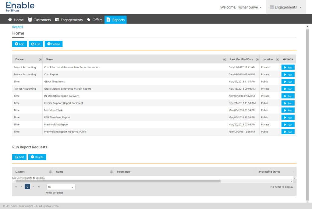
- Dataset-based reporting with clear ownership (public/private)
- Action-driven report execution (Run, Edit, Delete)
- Historical traceability through transaction and report logs
8. Visual & Interaction Design
- Clean enterprise visual language aligned with Silicus branding
- Strong use of whitespace to manage dense information
- Consistent button hierarchy (Save, Cancel, Void, Run)
- System feedback for success, approval, and sync states
The UI intentionally favoured clarity over decoration, aligning with financial users’ expectations.
9. Accessibility & Usability Considerations
- High contrast for financial data readability
- Keyboard-friendly form navigation
- Predictable tab orders and field grouping
- Clear error and success messaging
10. Outcomes & Business Impact
- Streamlined invoicing and payment workflows across customers
- Reduced operational errors in billing and reconciliation
- Faster onboarding of new enterprise clients
- Improved trust through transparent financial tracking
- Scalable foundation for future automation and integrations
11. Learnings & Reflections
- Enterprise UX succeeds when process clarity beats visual novelty
- Finance users value predictability, traceability, and confidence
- Designing admin systems requires restraint and safety-first thinking
- Strong information architecture is the backbone of complex products
12. Final Note
Enable demonstrates how thoughtful UX design can transform complex financial operations into efficient, reliable, and scalable enterprise experiences. The project reinforced the importance of aligning UX decisions with business rules, compliance needs, and real-world workflows—delivering value not just to users, but to the organisation as a whole.