
Designing the Complete UPI Lifecycle — HSBC India (Mobile X)

Client: HSBC India
Platform: Mobile (Android & iOS)
Industry: Wealth Banking & Financial Services
Timeline: 2 Years
Role: Lead UI/UX Designer
Team: Product, Design, Engineering, Business, QA, Compliance
Over two years, I owned the complete UPI experience for HSBC India’s Mobile X app — not one flow, the whole lifecycle: setup and identity (Manage VPA), platform migration (Simply Pay → Mobile X), payment initiation (Scan QR, Intent Call), recurring payments (Mandates), and exit/recovery (Dispute, Deregister). The common thread across all seven was trust — in banking, users don’t just need a transaction to work; they need to believe it worked. The hard part wasn’t any single screen; it was designing consistent trust signals across seven very different journeys, inside RBI/NPCI regulation, legacy backend limits, and a distributed team. Result: fewer drop-offs, fewer support escalations, and design became something leadership consulted early, not something handed a finished spec.
Scope — 7 UPI journeys designed end-to-end, covering the full lifecycle:
One-Time & Recurring Mandate (Payer)
UPI — Scan QR Code
UPI Intent Call
UPI Migration: HSBC Simply Pay → HSBC Mobile X
Manage Your VPA
UPI — Raise & Track Dispute
Deregister from UPI Services

1: The Problem
Business context: UPI isn’t a feature; it’s a daily habit. Any friction in an HSBC UPI journey directly hits adoption, trust, and retention — and HSBC needed all seven of these journeys to feel like one coherent product, not seven separately shipped features.
What was broken:
Issue
Inconsistent flows across Android/iOS
Cognitive overload at payment moments
Unclear success/pending/failure states
Repeated authentication friction
Support had no context on disputes
No single owner across the UPI surface
Why it mattered
Users relearn the app depending on device
Errors and drop-offs at the highest-stakes step
Users couldn’t tell if money actually moved
Abandonment during retries
Slower resolution, more escalations
Each journey risked drifting into its own patterns
Constraints I had to design inside of (not around):
- RBI & NPCI regulatory guidelines
- Strict security/compliance requirements
- Legacy backend dependencies limiting real-time feedback
- Need to stay in parity with the evolving UPI ecosystem
2: My Process
Discover → Define → Design → Validate → Deliver
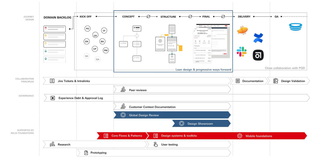
2.1 Discover — Research inputs
I didn’t run research in isolation — I pulled from what HSBC’s internal research org already had, and mined it for design-relevant signal across all seven journeys:
- User interviews & usability test reports
- Analytics/funnel data
- Heuristic audits & competitive benchmarks
- Product owner insights from live market rollouts
Key insights that changed my design decisions:
- Users anchor on status confirmation, not transaction speed — a fast payment with an ambiguous confirmation still felt untrustworthy (this shaped Scan QR, Intent Call, and Mandate confirmations equally).
- Ambiguous system messages caused users to retry actions unnecessarily, sometimes double-paying.
- Users wanted progressive disclosure — not everything up front, especially in setup-heavy flows like Manage VPA.
- Authentication fatigue was a leading cause of abandonment on retry, most visible in the Migration and Mandate journeys where users had to re-establish trust in a “new” experience.
2.2 Define — Strategy before screens
I set four principles before touching UI, so every one of the seven journeys had the same test to pass — this is what made them feel like one product instead of seven separate builds:
- Clarity over cleverness at every transactional moment
- Fail safely, recover gracefully
- Consistency across journeys and platforms
- Compliance-by-design, not bolted on after
These mapped to measurable goals: reduce cognitive load, improve state visibility, standardise on Mobile X foundations, speed up decisions for both users and support agents.
2.3 Design — Where the work actually happened
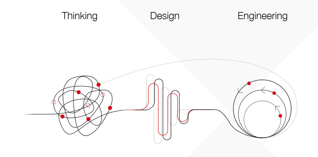
Each journey solved a different job, but shared the same lifecycle-state and trust-signal system:
Journey: UPI — Scan QR Code
Core design problem: Fastest possible path from camera to confirmed payment, without sacrificing status clarity
Journey: UPI Intent Call
Core design problem: Handing off cleanly between HSBC and third-party payment apps without losing user trust mid-handoff
Journey: UPI Migration: Simply Pay → Mobile X
Core design problem: Re-platforming an existing habit without users feeling like they’d lost functionality or control
Journey: Manage Your VPA
Core design problem: Making an abstract concept (Virtual Payment Address) simple enough for low-literacy users to manage confidently
Journey: UPI — Raise & Track Dispute
Core design problem: Turning a moment of anxiety (money missing) into a guided, trackable process instead of a support ticket black hole
Journey: Deregister from UPI Services
Core design problem: Giving users a safe, reversible-feeling exit path — critical for trust even when they’re leaving
Journey: One-Time & Recurring Mandate (Payer)
Core design problem: Making recurring auto-debit feel controllable, not risky, by surfacing clear consent and cancellation paths
Key decisions applied consistently across all seven:
- Introduced explicit transaction lifecycle states (so “pending” looks different from “failed,” not just says so)
- Simplified IA for critical actions; cut steps wherever regulation allowed
- Standardised micro-interactions specifically to reinforce trust at risky moments
- Built on the HSBC Mobile X design system, with hierarchy-driven layouts and thumb-friendly zones
The trade-off I had to make: Backend constraints meant true real-time feedback wasn’t always possible — most acutely in Dispute tracking and Mandate confirmation. Where I couldn’t give an instant answer, I designed a transparent holding state instead of a vague spinner — telling the user what’s happening and what to expect, rather than pretending things were instant.
2.4 Validate — Before it ever reached a jury
- Cross-functional design walkthroughs and peer reviews, run per-journey but checked against the shared principles
- Design QA against real transaction scenarios (not just happy paths) — especially important for Dispute and Deregister, where the “unhappy path” is the main path
- Iteration on copy, states, and transitions based on regulatory clarifications as they came in
- Early stakeholder reviews to catch risk before it became rework
2.5 Deliver — Getting it shipped, not just designed
- Presented each UPI journey to internal design juries for final sign-off
- Worked directly with engineering on feasibility/handoff, QA on edge cases, and compliance on regulatory alignment
- Ensured cross-platform parity and WCAG-aligned accessibility (including iconography built for low-literacy users) across all seven journeys
3: Impact
3.1 Quantitative
(directional — confidentiality limits exact figures)
- Reduced drop-offs across UPI journeys
- Improved comprehension of transaction success states
- Fewer repeat attempts and support escalations
- Faster internal approval cycles, because flows were clearer to review
3.2 Qualitative
- Higher stakeholder confidence in design maturity
- Tighter alignment between business, tech, and design
- Improved customer trust during high-risk, high-value transactions
- A coherent UPI experience across setup, payment, recurring, and exit — not seven disconnected features
UX went from a delivery function to a decision-making input.

4: Leadership & What I’d Do Differently
What I owned beyond the screens:
- Alignment across multiple pods and stakeholders with competing priorities, across all seven journeys simultaneously
- Design rationale backed by evidence, used to influence prioritisation — not just aesthetic calls
- Mentoring designers on enterprise-grade UX standards
- Holding the line on design integrity under regulatory and technical pressure
Honest reflection:
- Worked well: strong design governance, early stakeholder involvement, success metrics defined beyond “does it look good”, a shared principle set that kept seven journeys feeling like one product
- Would improve: validate edge cases with real customers earlier (especially for Dispute and Mandate, where edge cases are the whole point), and build automated analytics feedback loops post-launch instead of relying on manual review
The takeaway I lead with in interviews:
“Enterprise UX is orchestration, not screens — balancing business risk, human behaviour, and system constraints across an entire product surface, not just one flow.”