
Designing OneSupport: Unifying Global Medical Complaint Management at Scale

Product: Enterprise Web Application (SaaS)
Industry: Healthcare Devices
Timeline: March 2018 – December 2018
Role: Senior UX Designer / Experience Lead
Client: Getinge (Global Healthcare Technology Company)
Location: Onsite – New Jersey
Executive Summary
Getinge OneSupport was redesigned to address critical breakdowns in how healthcare professionals and internal teams managed equipment complaints, patient-impact events, and regulatory reporting across global markets.
The core challenge was not visual modernisation—but reducing risk, error, and time-to-resolution in a highly regulated, high-stress environment where incomplete or incorrect data could directly impact patient safety and FDA compliance.
As the UX lead, I owned the end-to-end experience strategy, from research and information architecture through execution, validation, and stakeholder alignment. I worked closely with quality, compliance, engineering, and business leaders to ensure the design met regulatory obligations while significantly improving usability and operational efficiency.
High-level impact included:
- Faster complaint creation and review cycles
- Improved data completeness for regulatory reporting
- Reduced cognitive load for frontline healthcare users
- Increased confidence and trust in complaint workflows across teams
Business Problem & Market Context
Core Business Challenges
- Complaint submission was slow, fragmented, and error-prone
- Critical data (UDI, product, patient impact) was often missing or inconsistent
- Existing workflows mirrored internal systems, not real hospital environments
- High dependency on training and tribal knowledge
Regulatory & Enterprise Constraints
- FDA complaint handling requirements (data accuracy, traceability, auditability)
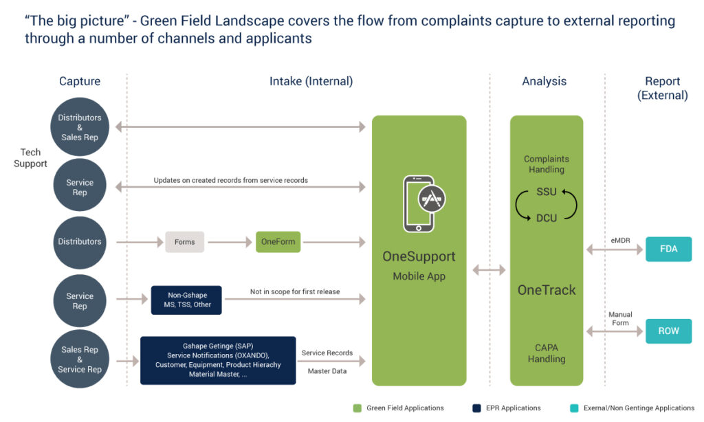
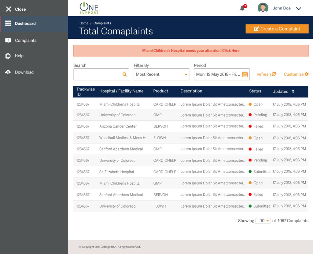
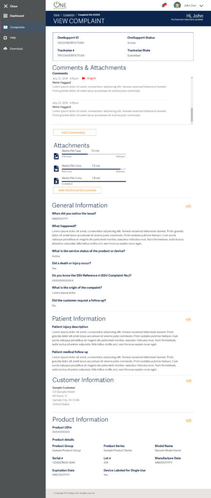
- Integration with Trackwise for complaint status and lifecycle management
- Multi-role usage (hospital staff, service techs, quality teams, internal reviewers)
- Offline and low-connectivity usage in hospital basements and restricted areas
Why This Mattered to the Business
Complaint handling is not a support feature—it is a core risk and compliance function. Inefficiencies increased regulatory exposure, delayed investigations, and reduced trust with hospital partners.
Improving this experience had direct implications for:
- Compliance readiness
- Operational efficiency
- Brand credibility in life-critical environments
UX Strategy & Design Vision
Experience Vision
Design a guided, confidence-building complaint workflow that adapts to user expertise while ensuring regulatory completeness—without overwhelming the user.
Strategic Principles
- Progressive disclosure over dense forms
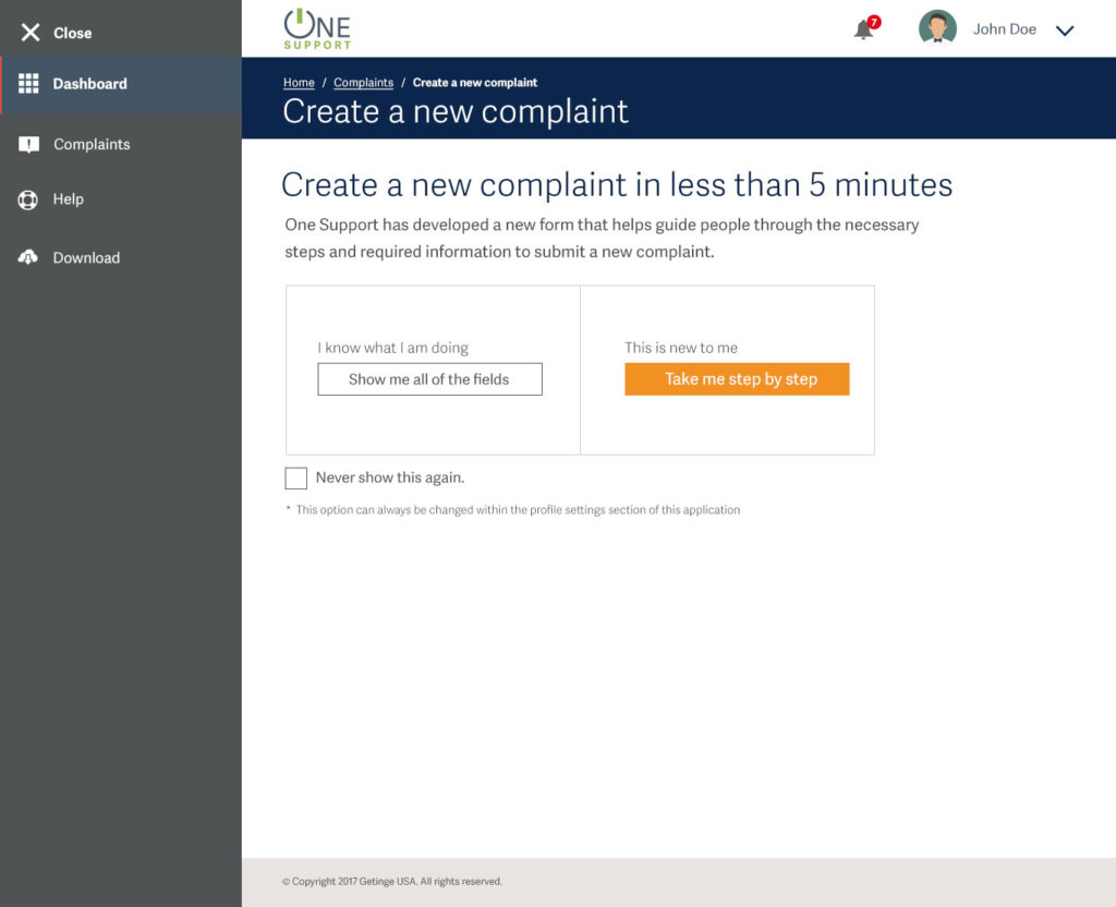
- Guided flows for new users, efficiency paths for experts
- Design for worst-case environments (stress, interruptions, low bandwidth)
- Compliance by design, not compliance by training
Key Hypotheses
- Step-based guidance would reduce form abandonment and errors
- Explicit review and confirmation would improve data accuracy
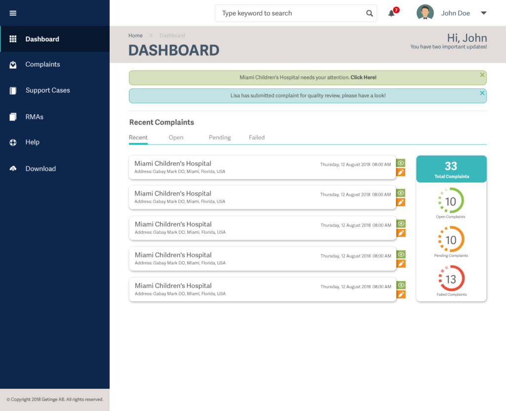
- Clear status visibility would reduce follow-up requests and escalations
Success Metrics
- Time to submit a complete complaint
- Reduction in incomplete or returned complaints
- User-reported confidence and clarity
- Internal quality team efficiency
User Research & Insights
Research Methods
- 12 in-depth on-site interviews (45 minutes each)
- Task-based walkthroughs of existing systems
- Card sorting workshops for complaint structure
- Contextual inquiry in hospital environments
Key User Groups
- Hospital administrators and clinicians
- Service technicians
- Quality and complaint management teams
- Internal Getinge support and compliance teams
Critical Insights
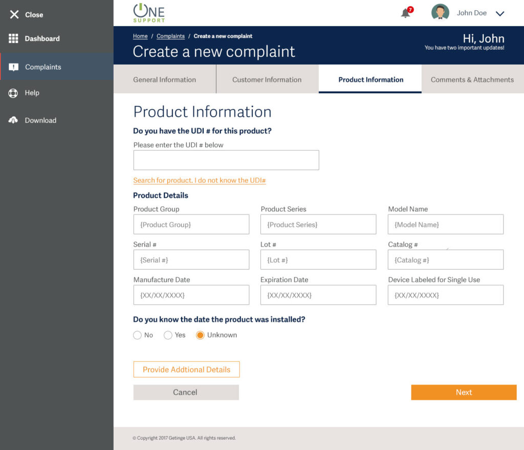
- Users rarely had all the information upfront (UDI, serial numbers, install dates)
- Fear of “doing it wrong” slowed submissions more than system complexity
- Experienced users wanted speed; new users wanted reassurance
- Review and confirmation were essential for confidence, not friction
These insights directly shaped the step-by-step vs expert mode, field optionality, and review flows.
Experience Architecture & Journey Design
Journey Highlights
The complaint flow was re-architected into logical, decision-driven stages:
- Entry & intent selection (guided vs all fields)
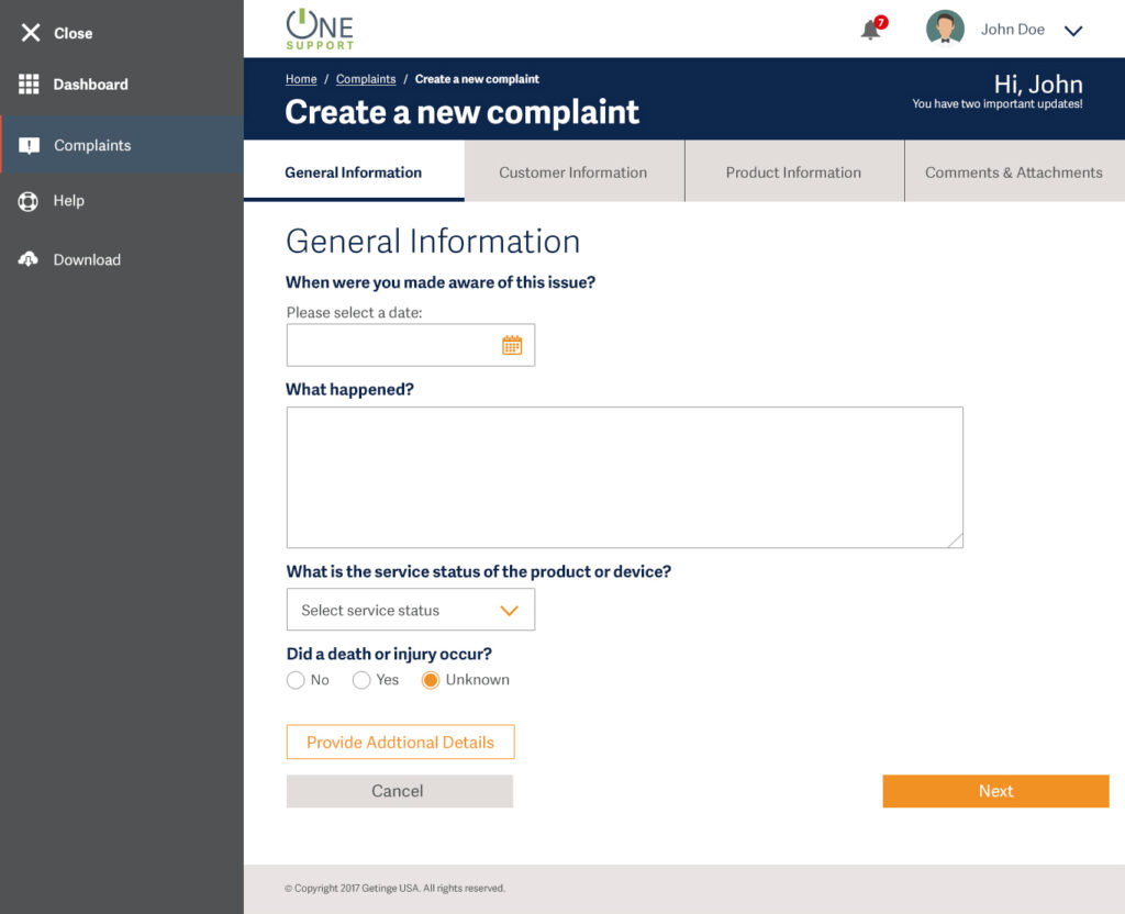
- General issue context
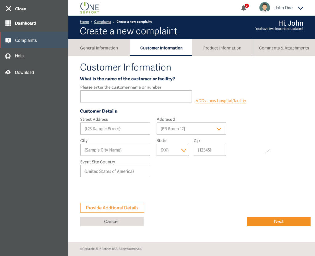
- Customer/facility information
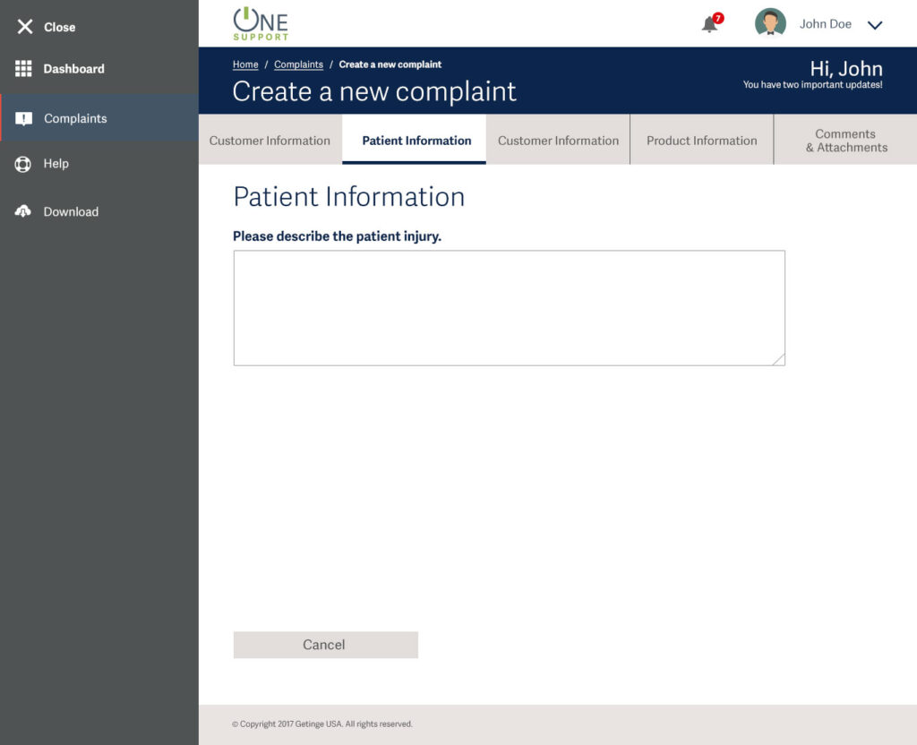
- Patient impact (when applicable)
- Product and UDI capture
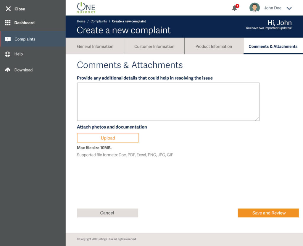
- Comments, attachments, and evidence
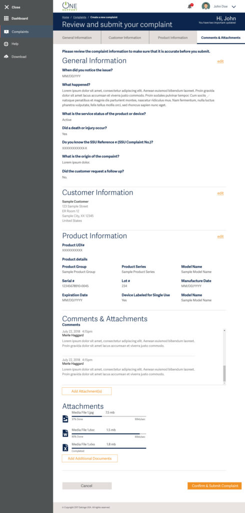
- Review, confirmation, and submission
Key Friction Points Addressed
- Overloaded single-page forms
- Mandatory fields that users could not realistically provide
- Lack of clarity on progress and completion
- No clear moment of confirmation or ownership
Trade-offs
- Slightly longer guided flows in exchange for higher data quality
- Optional fields surfaced contextually instead of enforced upfront
Design Execution
Interaction Design
- Clear step indicators to reduce anxiety and improve orientation
- Explicit decision points (e.g., injury occurred, UDI known)
- Contextual help and alternative paths (search vs manual entry)
Visual & Component Strategy
- Enterprise-grade UI prioritising clarity over decoration
- Consistent form patterns across modules
- Status colour usage aligned with operational urgency, not branding alone
Accessibility & Scalability
- Readable typography and contrast for clinical environments
- Touch-friendly controls for tablet usage
- Scalable layout from desktop to constrained screens
Collaboration
- Close partnership with engineering to align on Trackwise dependencies
- Continuous alignment with quality and regulatory stakeholders
- Iterative reviews with business owners to manage scope and risk
Desktop Wireframes
Tablet Wireframes
Mobile Wireframes
Use password- Pa55W0rd
Use password- Pa55W0rd
Use password- Pa55W0rd
Some wireframes and detailed flows for this case study are hosted externally and are password-protected to respect client confidentiality and data sensitivity.
Validation & Iteration
Validation Methods
- Task-based usability testing with representative users
- Iterative prototype reviews with internal teams
- Scenario testing for incomplete and edge-case data
Key Iterations
- Simplified language around regulatory concepts
- Improved visibility of “what happens next” after submission
- Enhanced review screen to support final confidence checks
Design decisions consistently prioritised risk reduction over visual preference.
Business Impact & Measurable Outcomes
Quantitative Outcomes
- Faster complaint submission times
- Fewer incomplete or returned complaints
- Improved data quality for regulatory review
- Reduced internal follow-ups for missing information
Qualitative Outcomes
- Increased user confidence during submission
- Improved trust between hospitals and Getinge support teams
- Clearer accountability and ownership across complaint lifecycles
UX directly influenced how the business reframed complaint handling as a guided service, not a compliance burden.
Leadership & Influence
Acted as the single point of UX ownership across modules
Facilitated alignment between compliance, engineering, and business teams
Advocated for user-centred trade-offs in a regulation-heavy environment
Helped establish reusable patterns for future enterprise workflows
My role extended beyond screens into decision framing, prioritisation, and risk mitigation.
Challenges & Trade-offs
Constraints
- Legacy system integration limitations
- Regulatory immovables
- Varying user maturity and technical comfort
Hard Decisions
- Designing for the least-informed user without penalising experts
- Accepting controlled complexity where regulatory needs demanded it
- Deferring non-critical enhancements to protect core workflows
Complexity was managed through progressive disclosure and intentional defaults.
Key Learnings & Reflection
- Compliance-driven UX succeeds when users feel guided, not policed
- Confidence is a measurable UX outcome in regulated systems
- Enterprise UX leadership is about decision clarity, not interface volume
- Designing for worst-case scenarios creates resilience everywhere else
This project strengthened my ability to balance human needs, regulatory rigor, and business reality at scale.
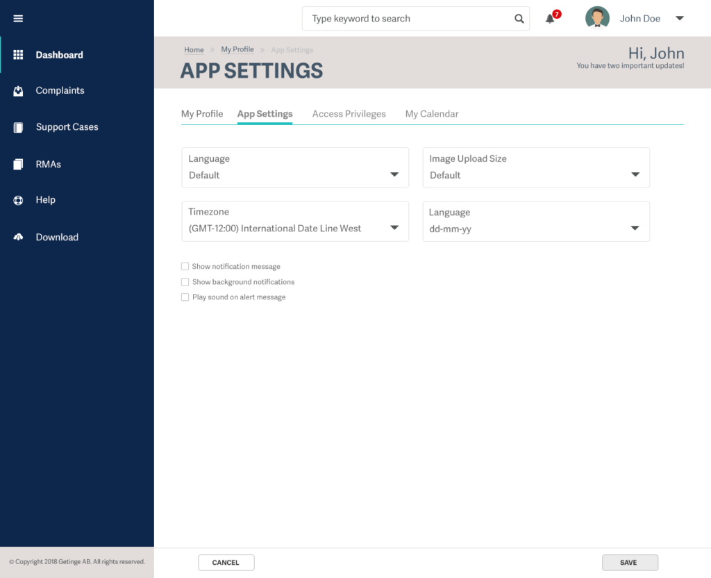
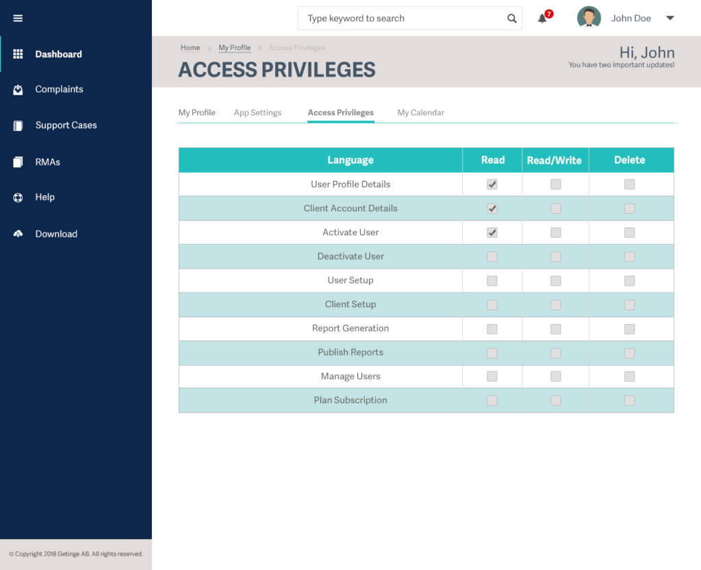
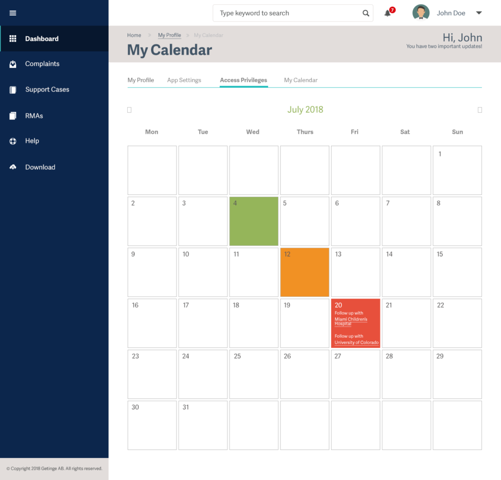
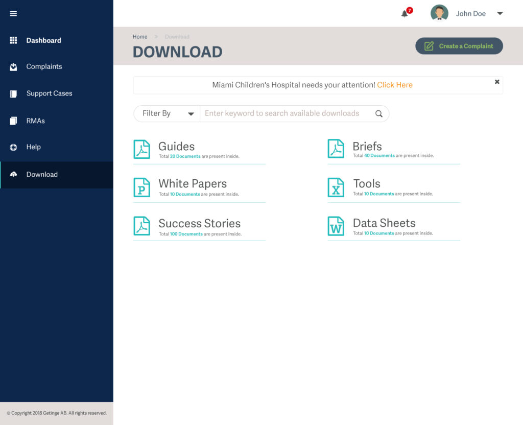
Mockups

Curious how this would look in 2025?
This case study documents the original 2018 UX work for Getinge OneSupport, designed under the constraints, tools, and enterprise standards of its time.
Since then, design tooling, AI capabilities, and enterprise UX expectations have evolved significantly.
To explore how this same problem space can be re-imagined today, I’ve redesigned the OneSupport experience using modern AI-assisted workflows and 2025 UX best practices—while staying grounded in the original business, regulatory, and user needs.